Task 1: Bring the Data into Power Query
- Open a blank workbook and launch Power Query to examine the contents of a text file.
Data (tab) -> Get & Transform (group) -> From Text/CSV.
- Browse to the text file.
- In the Power Query preview window, select Transform Data.
- Rename the Query “SalesByState”.

The only information we need to retain for our report is the State and Sales.
Task 2: Determine the State for Each Record
- Select the “CityState” column and extract the state portion by clicking Transform (tab) -> Text Column (group) -> Extract -> Text Between Delimiters.
- The Start Delimiter will be “(“ [open parentheses – no quotation marks]
- The End Delimiter will be “)“ [close parentheses – no quotation marks]

- Click OK.
- Rename the “CityState” column to “State”.

Task 3: Group Records by State
- Select Home (tab) -> Transform (group) -> Group By.
- In the Group By dialog box, enter the following parameters and click OK.

- Not necessary for reporting but sort the results in Ascending order by State.

Featured Course
Black Belt Excel Package

Task 4: Load the Results into an Excel Table
- Select Home (tab) -> Close (group) -> Close & Load.

The results are as follows.

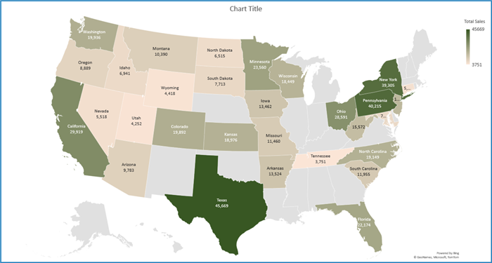
Task 5: Create the Filled Map Chart
- Select a cell in the results table and click Insert (tab) -> Charts (group) -> Maps -> Filled Map.

Note: Available in Microsoft 365 and Excel 2021.
The base results are as follows.

NOTE: In the event the map does not detect your states properly, add a Custom Column in Power Query named “Country” that reads “United States”.
Task 6: Customize the Filled Map Chart
- By double-clicking anywhere on the Filled Map chart, you can gain access to the chart customization controls.

- Experiment with the different options for Map Projection, Map Area, and Map Labels.
- Experiment with changing the colors for the Minimum and Maximum values. These can be based on the extremes of the data, fixed values, or fixed percentages.
NOTE: The labels will appear in states that have enough size to display the text. You may need to increase the size of the chart to read longer names. This is a prime reason for using 2-letter state codes in place of full state names.
- Right-click any state and select Add Data Labels to display the underlying values for Sales.
- Select any state’s data label (sales value) and customize the number formatting as desired (ex: comma style with no decimal place precision.)

Mission accomplished.
Not a single formula was written; not a single function used.
Depending on the customization level, it’s possible you could have created this entire thing with barely any keyboard interaction.
Learn more about Power Query here.
You can also check out an alternative map chart solution that works with any version of Excel, or learn how to create map charts in Power BI.
Practice Workbook
Feel free to Download the Workbook HERE.

Leila Gharani
I'm a 6x Microsoft MVP with over 15 years of experience implementing and professionals on Management Information Systems of different sizes and nature.
My background is Masters in Economics, Economist, Consultant, Oracle HFM Accounting Systems Expert, SAP BW Project Manager. My passion is teaching, experimenting and sharing. I am also addicted to learning and enjoy taking online courses on a variety of topics.


