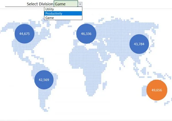
In addition, Excel provides an opportunity to create a dynamic interactive diagram (including Map Charts), by adding dropdowns to select a desired output directly on a chart.
Interesting fact
The latest version of Excel (Excel 365 and the latest updates for Excel 2016) have a built-in feature to insert a Map Chart (powered by Bing) in a Workbook. You can find it in your Excel Workbook in the following way:
INSERT tab on the Ribbon > Charts > Maps. This is a good tool that can save a lot of time in multiple situations. However, there are several serious shortcomings of this feature that set a limitation for its regular use. The first one is that you need to share data with Bing, i.e. we cannot do that when we work with vulnerable data (e.g. some commercial or nondisclosed information). The second shortcoming: The built-in “Map Chart” option in Excel is not as flexible as the chart we build in this tutorial. And the last one is the fact that the built-in option doesn’t work in previous Excel versions. The technique you learn here works in all Excel versions.
PART №1 Data Preparation & Scatter Plot
The small sample data in this tutorial is very simple but it demonstrates the approach we’ll use to build a nice looking interactive map chart. You can easily apply this technique whatever type of regions, products, divisions or other numeric values you want to show. The main principle here is building a scatter plot (with a custom background image) that will be converted later into a bubble chart.
Pro Tip: This technique is based on the feature of a scatter plot to show its values according to their X and Y coordinates on a chart area. We use that to set the required position of all our Regions. A custom background image is used to visualize an appropriate geographical area (world map, country map or regional map). Once those steps are done, we’ll convert a scatter plot into a bubble chart. Technically, a bubble chart is the same as a scatter plot, but with an additional dimension, so we use this trick to add one extra dimension to our existing scatter plot. This will be used for our KPI.
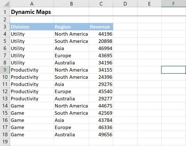
The table in the image below has 3 columns that contain information needed for the map chart. We have information on Revenue (column C), Divisions (column A) and geographical Region (column B). The creation of a map chart requires a little bit of preparation. The more Regions we have in a table, the more preparation work we need to do to create the chart. The good news: we need to do this only once. After we have done this step, we can add as many KPIs as we need without any problem.
Step 1. Insert an Empty Scatter Plot.
Click on a blank cell outside the data table (otherwise a scatter plot will be built on the values from this table). After that go to:
INSERT tab on the ribbon > section Charts > Insert a Scatter Plot
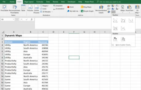
Why do we create a blank scatter plot? Because we don’t have any values to set a correct position for the Regions as the Revenue by itself doesn’t represent any information about the required X and Y coordinates. So we need to add such data by ourselves a bit later.
Step 2. Select a Custom Background Image as the map chart.
Based on that, we will define the X and Y coordinates. To do this we need to select the chart area. Double click on the chart area to open the panel with Format Chart Area options. Here we need to select and expand Fill options. From the list visible, we need to select Picture or Texture Fill. Once we select this radio button, we’ll see three options: Insert an image from File…, Clipboard or from Online… source. We can use the first one if we already have an image saved on our computer. The second option will be active when we have copied an image and we want to paste it from the Clipboard. In this tutorial, we use the third option – Online… – so let’s import the image from the Internet. Click on the Online… button to bring up the search Window. In the Bing search field, type the required keyword(s) – we used this combination:

Pro Tip: If you want, you can select an image from OneDrive cloud. You can toggle between Bing and OneDrive (or between more sources if you have access to them) by clicking on the Bing icon near the search field.
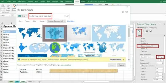
Note! Keep in mind that we can use any image we want if we are building the chart only for our personal needs. However, if we need to use the Excel file for any commercial or business purposes (or share the file with other people), we are only allowed to use the images that are tagged with Creative Commons licenses (the default search option). Otherwise, the use of an image protected by copyrights can be considered as copyright infringement and cause appropriate legal consequences.
Consider, however, that even this license category has several different image types and some of them may require the use of the appropriate Creative Common attribution. You can find more details about a license type and an attribution that is required by a specific image by following the link under the selected image.
Once we select the desired image, click the Insert button to add it as a background for the chart area.
Step 3. Change the size and slightly edit the background image so it’s the size you’d like to have.
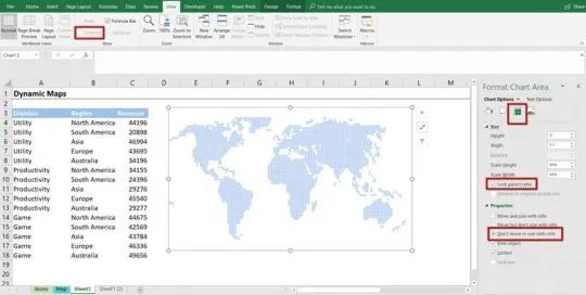
By default, the image is expandable in every direction, i.e. we can change it as we want. The problem is if we don’t lock its aspect ratio, the image can be deformed or stretched out in a wrong way when its horizontal and vertical size is changed disproportionately. To prevent this, we can double click on the image to open the Format Chart Area panel, then select and expand Size options and check the Lock Aspect Ratio box. Now the image size will be adjusted proportionally.
Pro Tip: You can lock aspect ratio temporally in an easier way, by simply pressing SHIFT button on the keyboard while you are expanding the image.
In addition, we can increase the transparency of the image as we want to focus attention on the Revenue more than on the image itself. To do that, we need to select Fill options on the Format Chart Area panel and set the Transparency parameter that can be found under the Buttons which we use to import the image from the external source. In this tutorial, we set the Transparency at 70%. Also, we do not want the image to change its size or position when we change or move the cells. Mark the Don’t move or size with cells radio button at the bottom of the same section.
Pro tip: Once the Transparency is increased, the gridlines become more visible. To hide the gridlines go to the VIEW tab on the Ribbon > Show section > uncheck Gridlines box.
Step 4. Set the position of the regions on the chart.
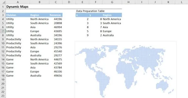
To do that we need to split the entire image area into imaginary coordinate axis (X and Y). To get the regions defined properly, we need to fix the X and Y axis. You can use any type of scaling you’d like, for example from 0 to 1, from 0 to 10, from 0 to 100 etc. We’ll write X and Y coordinates for every Region from our table accordingly to the selected scale. In this tutorial, we use Min 0 and Max 10 for both the X and Y axis.
Let’s create the additional table that will be used as a basis for the chart. Besides the list with names of unique Regions, this table needs to contain two additional columns – for X and Y coordinates respectively. Our initial step is to guess the position of every region (i.e. its central point) on the selected imaginary coordinate axis. In other words, we split the entire height (axis Y) of the image into equal parts from 0 to 10 and repeat this for the width (axis X). In such case, the estimate coordinates of North America will be near the point (x = 2, y = 8); the coordinates of South America – near the point (x = 3, y = 3) and so on. We need to repeat this exercise for all Regions, but only once.
Pro tip: We can copy/paste the list of Regions manually and that’s OK when we don’t have many of them. But in the case when we have, let’s say, 100+ regions, especially when they can be repeated several times inside the input table, it can be time consuming to prepare the list that contains only unique Regions without any duplicates. There is an array formula that can help in this case.
Let’s select cell G4 in our example and add the following array formula (make sure you press CTRL + SHIFT + ENTER at the end instead of ENTER to create an array formula):
{=IFERROR(INDEX($B$4:$B$18,MATCH(0,COUNTIF($G$3:G3,$B$4:$B$18),0)),””)}Drag and drop this formula to other cells (as many as you need) to return the list of the Regions without any duplicates.
Step 5. Add the data for the coordinates to the chart.
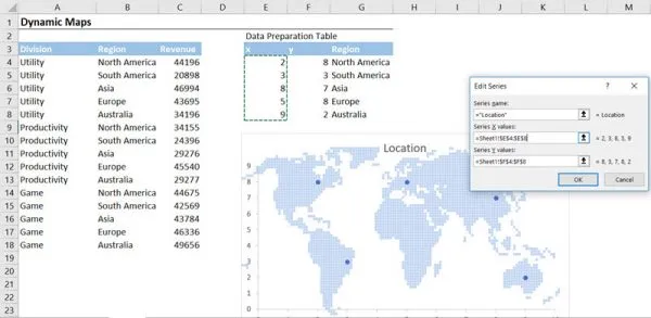
Right-click on the chart area and click Select Data. In the dialogue window that appears, select the Add series button at the left side of the window. Inside the Edit Series box that appears, add a Series Name as “Location”, and put the coordinates that we wrote into the appropriate fields for Series X values and Series Y values.
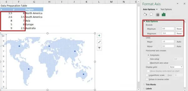
In case the axis is still set to auto-scale, adjust it. To fix the auto-scaling of the chart axis, select axis X and double-click it. On the Format Axis panel, we go to Axis options and manually input 0 (zero) as Minimum axis bound and 10 (ten) as a Maximum axis bound. If we did everything properly we see that the status near that values changed, and the button Reset appeared. Do the same exercise for axis Y. Once this has been ready, we can delete unwanted gridlines and axis titles. Just select the appropriate element on the chart area and press the DELETE button on the keyboard.
After we have cleaned the chart area, we can correct the coordinates that are still shifted.
PART №2 Adding the dependable Drop-down List. Converting the chart to another type. Adding a new extra dimension to the chart.
Step 1. Once all coordinates have been estimated properly, we can go further and add another dimension (Revenue) for every Region on the map. However, we want to make this dimension to be dependable from the selected Division, so we need to create an appropriate dependable drop-down list first of all. To do that, select any blank cell below the table with the coordinates, and type a heading (e.g. “Select Division”).
Select the cell on the right side of the current one and add the Drop-Down list via the Data Validation option. Go to the DATA tab on the ribbon > Data Tools section > Data Validation > Data Validation. In the field Allow, select From List option. Once we have done that, the additional field Source for the list values will appear. In this field, we need to specify the values that will be used as the elements of the drop-down list. We can select a range that contains such values, or type them manually in the case there are only a few values and they will not change in the future. Let’s type all three variants – ‘Utility’, ‘Productivity’, and ‘Game’ manually and click OK.
Feel free to add some visual effects to improve the visual appearance, like a Fill background color for the cell with a Drop-down list or a cell border at the bottom.
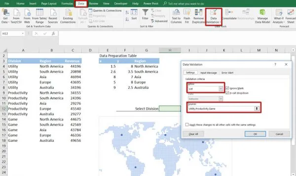
Pro tip: Instead of the manual typing, we can use the referring to a range of the cells (like $M$4:$M$6), to a named range or to Excel table (so-called smart table). The last approach is recommended as the Excel table is updated automatically every time when we add a new row, i.e. if we set such table as a source for the Data validation, the final drop-down list will be updated automatically every time we update the source table.
Step 2. It is time to add another column to the second table that will combine the Revenue value basing on two criteria – by Region and by Division. We need to create an appropriate formula. This formula is based on SUMIFS() function as this function accepts several conditional criteria.
The syntax of SUMIFS() function is the following:
= SUMIFS(sum_range, criteria_range1, criteria1, … criteria_rangeN, criteriaN), where
- sum_range – is a range that contains the values that we want to sum (range $C$4:$C$18)
- criteria_range1 – is a range of the same size as the sum_range, that contains the values used as criteria (in our case, this is Division column, range $A$4:$A$18)
- criteria1 – is a value that will be looked inside the criteria_range1 (in our case, this parameter is equal to the address of a cell in the second table that contains a name of the first Region i.e. cell $H$12 – North America).
- criteria_rangeN – any additional range that contains the values with additional criteria (we allowed to use up to 255 criteria). In our case, this is the Region column (range $B$4:$B$18).
- criteriaN – is any additional value that will be looked inside the criteria_rangeN (in our case, this parameter is equal to the address of a cell with a Drop-Down List that contains a name of the selected Division, i.e. cell G4).
Let write the formula into a new column for Revenue and drag-and-drop it for the entire column.
NB! Do not forget to fix the cell reference to look like $H$12 address (except cell G4 whose address should be dynamic when drag and dropping the formula down). Press F4 to make an absolute reference. Without that, the formula may return a wrong result.
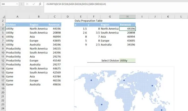
Pro tip: the SUMIFS() function appeared in Excel 2013. This function is not supported in the previous versions. For those, who want to use its alternative there is an array formula as shown below (for cell H4):
{=SUM(($A$4:$A$18=$H$12)*($B$4:$B$18=G4)*($C$4:$C$18))}Make sure you press CTRL + SHIFT + ENTER at the end instead of ENTER to create an array formula
Step 3. After the formula has been created and dragged down to the entire table, we can play with the drop-down menu to see how the Revenue values will be changed according to the selected Division in the Drop-down list. Once everything works properly, we can add Revenue to the chart. As it was mentioned above, there is a small trick here – we need to change the chart type and convert the scatter plot into a bubble chart, which has the additional dimension we need. To do that let’s select the chart area and go to the DESIGN conditional tab on the Ribbon > Type section > Change Chart Type. In the window with multiple recommended chart types, we need to select a Bubble chart in the same chart group as the current scatter plot. Click OK.
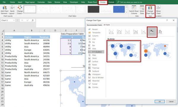
Step 4. You may notice that after the chart type is changed, the positions of the Regions are shifted. Don’t panic! The issue occurs as Excel is confused by the additional dimension and puts the axis X values in a wrong field of the chart series. So, let’s fix this manually: select the chart area, then right-click it, click on the Select Data command, and select the chart series in the left side of the Select Data Source window. Click the Edit button and repopulate the data in the appropriate field for the axes X and Y. Populate the Revenue data into the additional field Series Bubble Size.
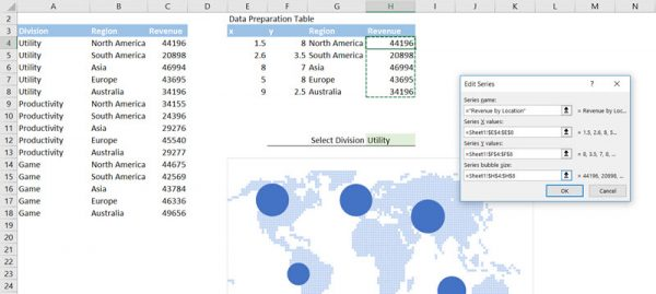
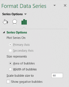
Step 5. Let’s make the bubbles occupy a bit less space on the chart to improve its readability. Select the chart area, then select any of the bubbles. Double click on the selection to open the Format Data Series panel. The bubble chart has the additional options on this panel – go to Series Options, check the Area of bubbles option and set Scale bubble size to 80%.
Also, we need to add the Data labels to show all Revenue values related to every bubble on the chart. Select the chart area and click on the icon with the + (plus) sign at the top right corner of the chart area rectangle. Select add Data Labels in the menu that appears.
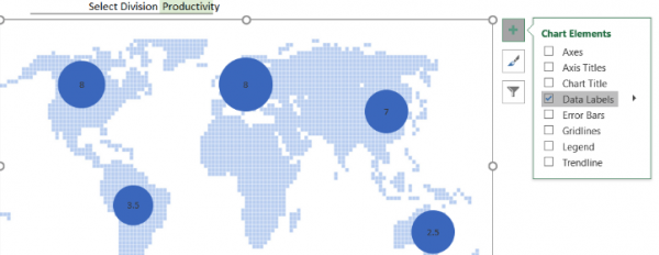
As you can see, the default data labels is not what we want to see inside the bubbles. We need to specify what data the series should use as a source for the labels. Double click on any data label. On the Format Data Labels panel, go to Label Options, unselect Y Value as source data and select Bubble Size. Make sure you also select a Label Position field as Center to move the data labels inside a bubble. Feel free to change the text color (to white, for example) to improve its readability.
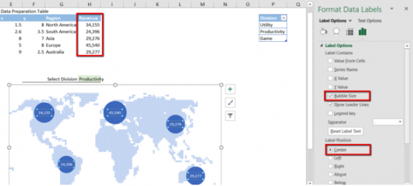
We can also improve the number format to use the additional separator for thousand. There are two options for how to do that. We can change the number format on the same Format Data Labels panel under the Label Options section – scroll down the page to see Number options. The second way we used in the video – we can set a custom number format in the source data range. Let’s select the column with Revenue values and press CTRL + 1 to open the window with the number formatting options.
Once we have done the visual formatting, the bubble chart is almost ready. The finishing stroke is adding the conditional color highlighting for the maximum Revenue value on the chart.
PART №3 Highlighting the Maximum value on the chart
Step 1. A good way to improve the readability of complex data in charts is by color highlighting a value depending on specific conditional criteria. This is achieved when adding a new series to chart. To do that, let’s add a new column in the second table that calculates the maximum Revenue for the specific Division. Name the column as Max Revenue. The series should contain only one value that will be shown only in the case that it’s the maximum value in the Revenue column. We can do this by adding a formula that’s based on the combination of the IF() and MAX() functions. Let’s type the following formula in the first cell of the new column:
=IF(H4=MAX($H$4:$H$8),H4,””)This formula uses the following logic – IF Revenue value in cell H4 is the Maximum value in the range $H$4:$H$8 THEN – return this value (cell H4), ELSE – return nothing.
Copy/paste the formula for the entire column.
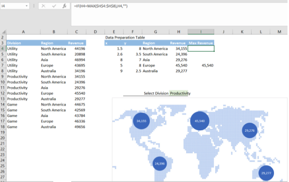
Step 2. This single value (the maximum Revenue) will represent the entire new series that we add now. Select the chart area, right-click and click Select Date. In the Select Data Source window, in the left-hand section, click the Add button. Populate the data for a new series from the second table. Consider that we need to specify the same columns for axes X and Y as we used for the previous series, but this time we specify a new column (Max Revenue) as source data for Series bubble size field. Name this series as Max Revenue (manually or just specify the cell with the appropriate column heading).
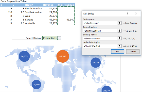
Now our chart becomes interactive, i.e. we can see immediately all changes to the bubble size and color accordingly to the selection we make in the Division drop-down list.
Feel free to Download the Workbook HERE.
Leila Gharani
I'm a 6x Microsoft MVP with over 15 years of experience implementing and professionals on Management Information Systems of different sizes and nature.
My background is Masters in Economics, Economist, Consultant, Oracle HFM Accounting Systems Expert, SAP BW Project Manager. My passion is teaching, experimenting and sharing. I am also addicted to learning and enjoy taking online courses on a variety of topics.


