Contents
CHAPTER 1:
Quick Gantt Chart

There are several ways of creating a Gantt Chart:
1. You can use an Excel chart.
2. Use conditional formatting and format cells to look like bars.
3. Use symbols and the repeat function to get the bars for the Gantt Chart.
This method uses an Excel chart (Method 1):

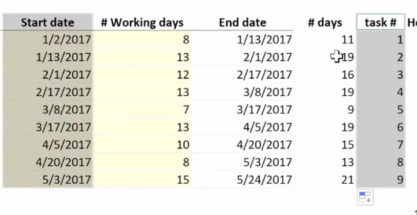
This is our data set:
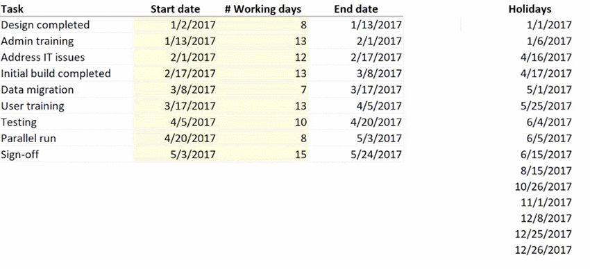
Start Date will be on the X-axis and Tasks on the Y-axis
The difference between Start and End date is going to define the length of the task, i.e, the length of the bars.
This will be different to the # of working days.
Why?
Because # of working days excludes weekends and holidays.
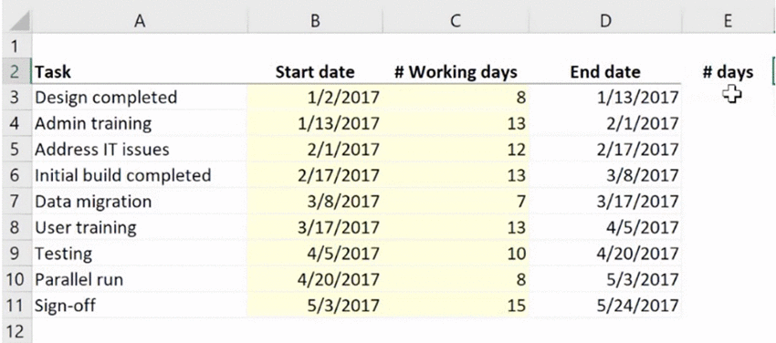
What type of chart should I use?
One of my favourite techniques is error bars, and conveniently, you can use error bars to show the number of Working Days.
And because they’re going to be horizontal, you can only have horizontal error bars in chart types where there are numbers on the X-axis.
So which chart type is that?
Scatter plot.
With the scatter plot, there are numerical values on the X as well as the Y-axis, and that way horizontal error bars can be used in the chart.
When using a scatter plot, there needs to be numbers on the Y. You can’t put text on the Y axis.
So, instead of the text, these tasks need to be numbered.
The full difference between the end date and the start date also needs to be calculated.
Preparing the data
Let’s add # days and task # on here.
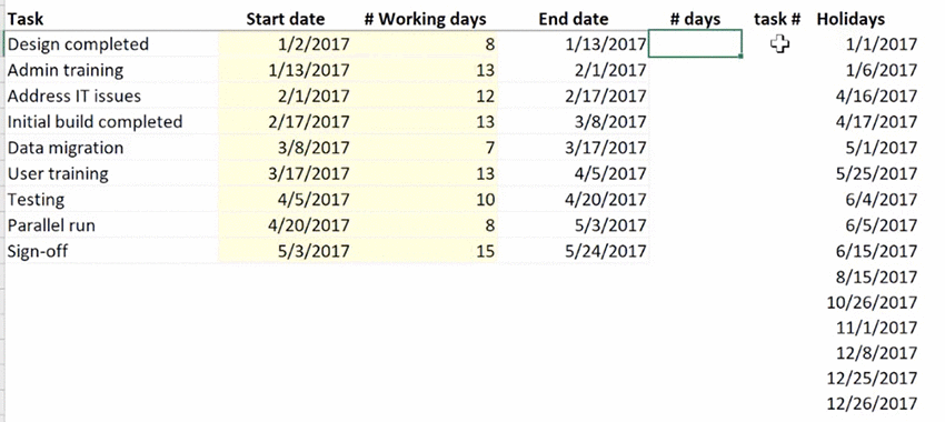
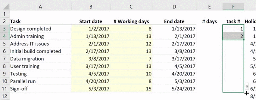
Task # needs an index of 1,2,3 etc.., Type in 1 & 2 in the first two cells and then pull down the reference. Excel’s autofill function populates the remaining indexes (you could use the ROW() function for dynamic Indexing.
The # days is going to be the difference between the end date and the start date.
E3 =D3-B3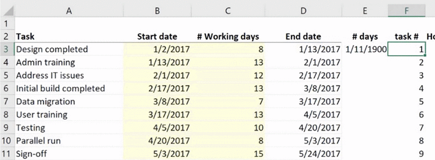
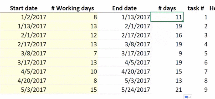
Format it as a number. Then copy the formatting down to the cells below.
So we can see that even though the number of working days is 8, the full number of days is 11.
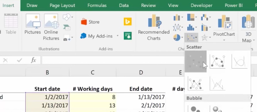
Mark start date, hold down the Ctrl key and highlight tasks – click on insert / scatter plot.
Making it more presentable
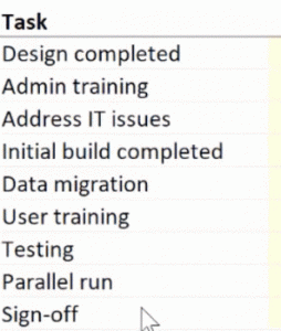
To be able to see which Task belongs to which bar, copy the tasks and paste them alongside the scatter plot like this:
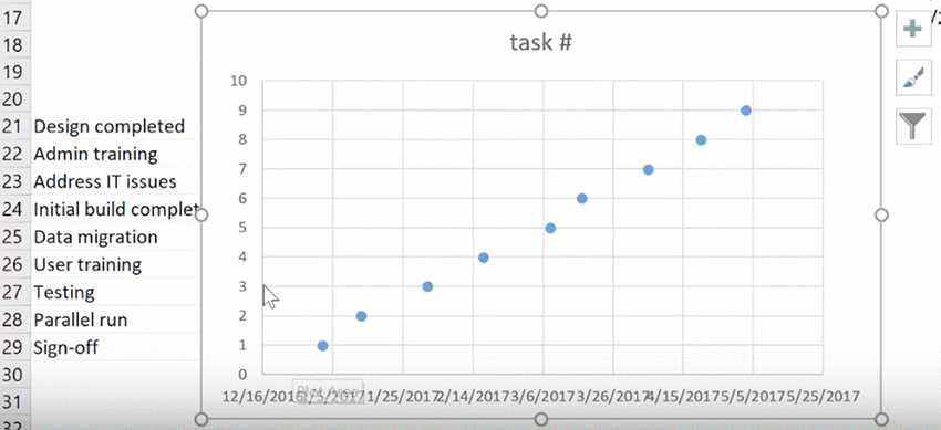
The aim is to put the scatter plot over the cells, but make them appear as one report.
We can see this is reversed, because in the cells, Task #1 is high, and on the chart, it’s low (1, corresponding to Task 1, is at the bottom), so we need to flip them over.
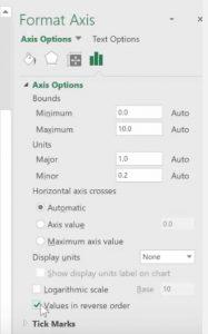
Double click the chart, go to the Axis Options, and click Values in Reverse Order. That switches them around.
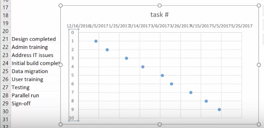
Ultimately the aim is to place the scatter plot seamlessly on the cells, so let’s take away the shape fill and the shape outline as well. Click on the chart, go to Format, Shape Outline and select No Outline.
These borders would look good if they continued across the row and onto the chart. To do that, highlight the cells in this area…

And add a light grey border to the outline of the cells.
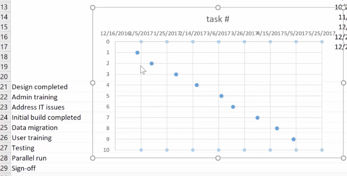
Delete the gridlines inside the chart.
Once you’ve completed the chart, you will need to align the tasks on the left-hand side with the bars in chart.
Now remove the Y-axis. For the X-axis, create more breathing space by horizontally expanding the chart size.

We can remove the Year from the X-Axis. It’s not necessary, and makes it too crowded.
Go to X-Axis options, Number. Untick Link to Source formatting. Overwrite the Format Code to take away the year so it’s the month and day only: m/d
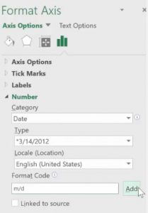

Based on this, we now have the position of the task for the start date, but we still need to find out how many days it would take, so that’s exactly where the error line technique is super useful.
Showing how many days each task will take
Select the scatter plot series, and add error bars.
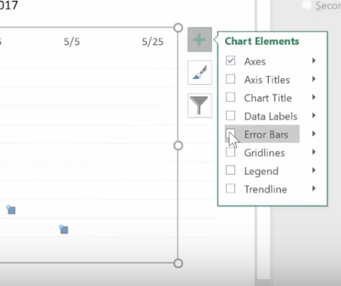

The vertical ones aren’t required, so delete those.

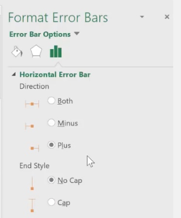
Click on the chart as a whole to view the options for the horizontal error bars. Under Direction, choose Plus. Select No Cap.
How long should the line be?

This depends on the number of days between the end date and the start date.
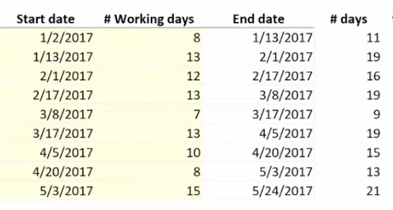
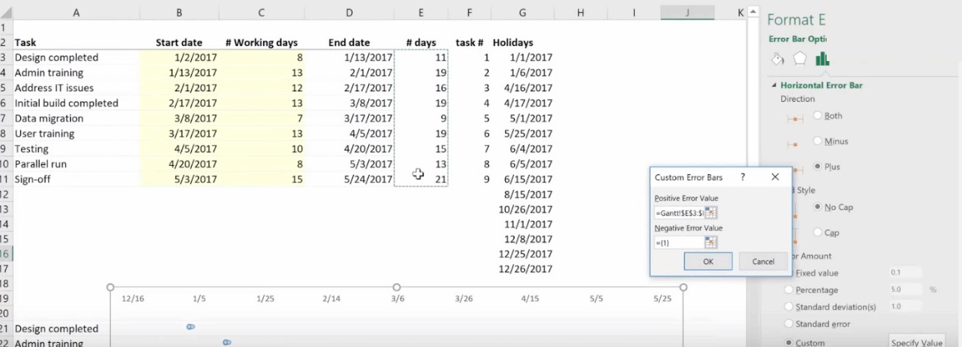
Select Custom, click on Specify Value, and for the plus Positive Error Bars, highlight the #days column data.
Now the different lengths appear on the chart as lines.

Turning the lines into bars
First off, turn the bars to a lighter gray in Formatting Options. Then thicken the line.

Check the positioning of it, so the bars meet up with the Tasks.
TIP: Best is to press Ctrl, and click the edge of your chart so you can move it with the arrow keys.
Click on the original points and hide them by selecting No Fill and No Outline.
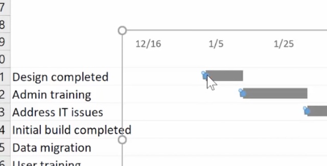
Now the tasks and the starting date are shown, with how long each task takes shown too.

Making it more readable
Adding number of working days to the chart
To add the number of working days to each task, copy the working days from column C, and do a Paste Special to paste alongside the chart.

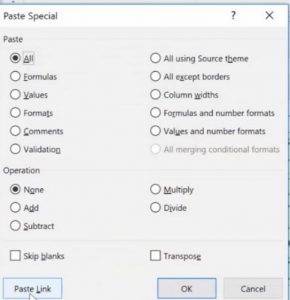
Paste the links, so they’re linked to the original data source by selecting Paste Link from the Paste special options.
That’s a quick way to visualize a project’s time plan in Excel using the Gantt Chart.
Video and Workbook
Feel free to Download the Workbook HERE.

Now you know how to create a basic Gantt Chart, it’s time to start building a more complete Gantt chart that compares plan to actual and shows % completion for each task.
Featured Course
Black Belt Excel Package

CHAPTER 2:
Fully Featured Gantt Chart

This Gantt Chart can do two more things than the previous one:
1. Show the percentage completion. The bars will be conditionally formatted depending on how much of the task is completed.
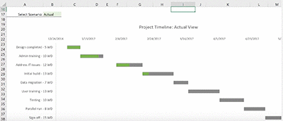
2. Compare the original time plan (Plan) to the Actual time plan. This allows you to keep track of how you make changes once the project takes off.
This will be created using an Excel chart.
The previous tutorial covered a basic Gantt Chart.
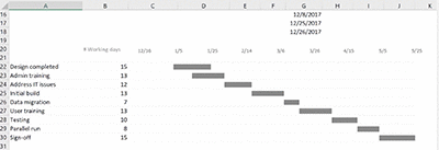
The quick Gantt chart is a fast way of visualizing your project plan before you start the project. At this point the aim is to get an idea of the timeline, number of working days each task takes, etc. Once you start working on the project, you actually want to update it and show which tasks are already completed.
To make the ‘Quick Gantt Chart’, a scatter plot was used with the error bar technique to show the number of days that each task would take. Tasks were put in cells, and the scatter plot was overlaid on these.

The ‘Fully Featured Gantt Chart’ will use a combination of two techniques.
- A stacked bar chart will show the length of the tasks.
- The error bar technique will show the percentage completion.
Setup
The Plan will be the list of original tasks. Copy and Paste it alongside. This second version will be for keeping track of the Actual times that each task takes.
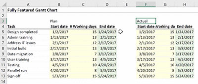
Originally, I used the Workday function to calculate the End date based on the number of working days, which excluded weekends and holidays (that are listed).

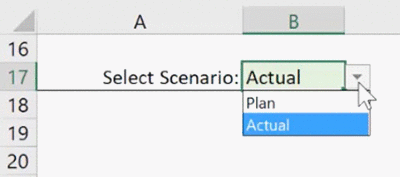
The same logic will be used for Actual, with an additional capability to change the view of the chart between Plan and Actual to reveal each respective version of the chart. This requires a data validation where the user selects the scenario.
In cell A16, write Select Scenario, and in B16, go to Data, and select Data Validation.
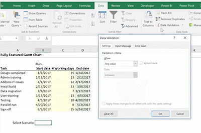
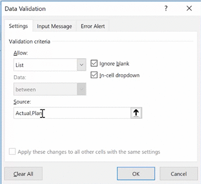
Allow ‘List’, and type in ‘Actual,Plan’.
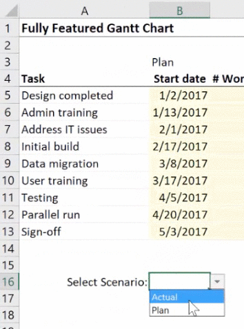
Format the cells accordingly: Plan will be fixed, in this case I’ve changed the cells’ background to green.
Actual will be changing, so I’ve set cells’ background to a light yellow.
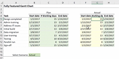
To see what happens when Scenario is changed, make some changes to the data for Actual.
To create a chart with different views, add a data preparation table. We need Start date and #days for the length of each task. The Start date will depend on what the user selects: Actual or Plan. The IF Function can work well here.
L5 =IF($B$16="plan",B5,F5)(Here, B5 is the Plan Start date, and F5 is the Actual Start date.)

Copy down the formula.
For # days, in
M5 =IF($B$16="plan",D5-B5,H5-F5)(Here, D5 is the Plan End date.
B5 is the Plan Start date.
H5 is the Actual End date.
F5 is the Actual Start date)

Copy down the formula.
Creating the Gantt Chart
Note: The Start date section in Data prep is not yet in date format for a good reason.
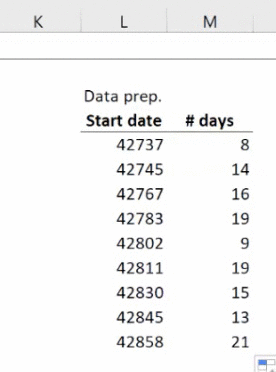
If they’re in date format, Excel gets confused and plots the dates on the Y-Axis.
Keeping the format as General means that Excel’s best guess matches up with the intention here.
Highlight Tasks (the Task section), hold the Ctrl key and highlight the Start date and # days section under Data prep.

Select Insert and choose the Stack Bar Chart.
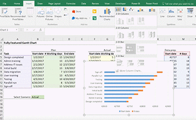
The orange part of the graph is the #days each task will take.
When creating this graph, Excel didn’t start from 0, instead it took a guess and set the minimum as 42650 (General format for min. date).
We need to adjust the minimum to start from approximately 42700 so there’s not a big gap. First, invert the category titles (the tasks) so they appear sequentially, with task 1 at the top and last task at the bottom. Double click the Axis to bring up the Format Axis settings.
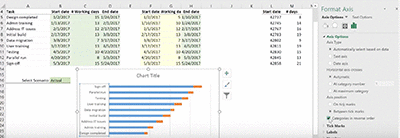
Under Axis position, tick Categories in reverse order.
Double click the X-Axis, and increase the minimum (in this example I increased to 42730).
Expand the chart. Remove the legend labels.
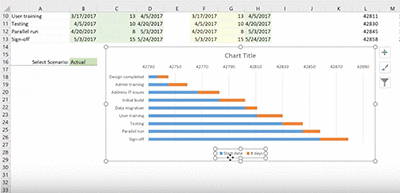
Hide the bottom stack from view by taking away the Fill color.
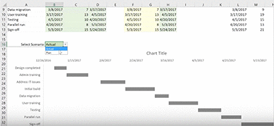
Select the bars, and in the Format Data Series sidebar, decrease the Gap Width to 100% to get thicker bars.

Change the bar color to a gray color.
Select and delete the chart’s vertical gridlines.
On the X-Axis, change the numbers to dates:
Since, by default, the number formatting of the axis values is linked to source, all we need to do is change the Start date formatting in Data prep.
Select the Start date section, cells L5-L13, and under Home, change General to Short Date. This changes the dates to appear in the format 1/2/2017 etc.
Remove the chart’s outline. Expand it and re-position.
Check if it works by changing between Actual and Plan in the drop down.
Add a dynamic chart title
To Make it obvious which view is currently being shown, i.e. Actual or Plan, write the following formula:
L3 ="Project Timeline: "&B16&" View"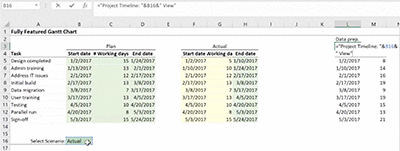
(Here, B16 is the cell with the drop-down between Actual and Plan)
Click on the Chart Title text box, go to the formula bar, and write…
=
…and click on cell L3 which holds the dynamic formula. This will update the Chart Title to show Project Timeline: Actual View
(if Actual is selected in the Drop Down)
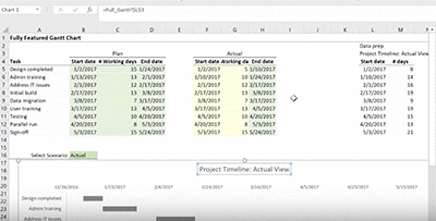
Change the Drop Down to Plan, and the Chart Title should change accordingly.
Add Percentage Completion
This shows which tasks are fully completed and which are in progress.
In Cell I4, write % Completion.
Select cells G5-G13, copy the formatting and paste it into cell I5. Select cells I5-I13, and in Home, change the formatting of these cells to %.
Type in some values for % completion:
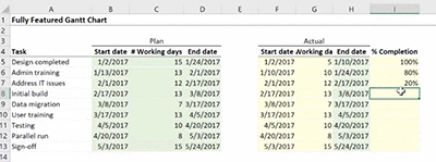
The aim is for these values to be reflected in the chart. To do this, use error bars.
As previously mentioned, if you want to show horizontal error bars, you need to use a scatter plot, as they have values on the X as well as the Y-Axis.
The bar chart also has horizontal error bars because it has categories on the Y-Axis and values on the X-Axis. This means it’s not necessary to introduce a new scatter plot series here. The existing series can be used, all we have to do is activate the error bars for that.
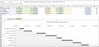
However, there are two series. The bottom and top stack. If the error bars for the bottom stacks are activated, a point is added at the end of the first stack and at the beginning of the second stack. That would be perfect in this case.
Highlight the stack, and activate Error bars.
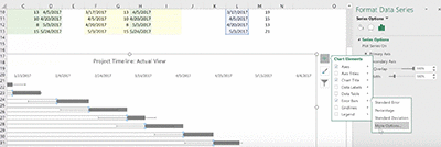
In the Format Error Bars sidebar, under Horizontal Error Bar, Direction, choose Plus.
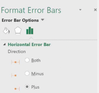
The length of the lines will depend on the % Completion.
The % Completion needs to be translated to days. So for example, if it’s 100% (in cell I5), the length should be identical to the value for #days (in cell M5) which is 8.
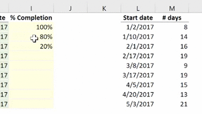
ADD # days completed to the Date Prep. Table.
N5 =IF($B$16="plan",0,I5*M5)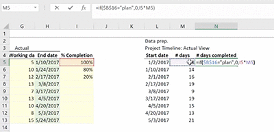
(Here, B16 is the cell with the drop-down for viewing Plan or Actual
I5 is % Completion
M5 is # days)
Copy down the formula.
In the Format Error Bars sidebar, under Error Amount, select Custom and Specify Value.
For the positive error bars, select the cells N5-N13 (the # days completed section). Press OK.
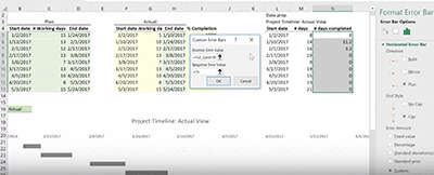
In the Format Error Bars sidebar, under End Style, choose No Cap.
Under the Paint Bucket symbol in this sidebar, change the color to green, and the Width to a thicker value of 8 pt.
To check, it’s clear that for Actual, the % Completion is visible.
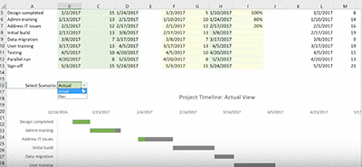
When the scenario is changed to Plan, nothing is visible as completion values don’t apply here.
Again, to check, change cells I7, I8 and I9 to 50%, 20% and 10% respectively. These changes are all reflected in the chart.
Add the number of working days to the chart
For clarity, the best place for this is on the X-Axis.
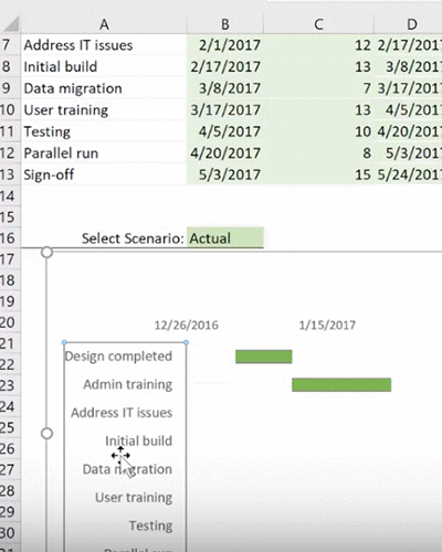
The X-Axis can be made dynamic by using formulas.
Add a new column to the Data Prep table to create a field that includes Task name AND the number of working days.
K5 =IF($B$16="plan",A5&" ("&C5&" WD)",A5&" ("&G5&" WD)")(Here, B16 is the cell with the drop-down to choose the Scenario,
A5 is the task, C5 is the Plan # Working days & G5 is the Actual # Working Days)
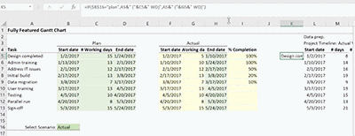
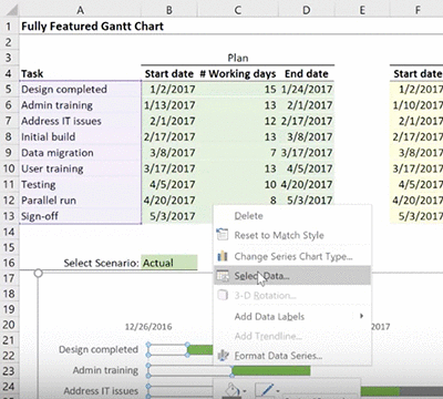
The last step is to replace the X-axis on the chart with this list of tasks we’ve just created (K5-K13).
Click the chart and choose Select Data.
Under Horizontal (Category) Axis Labels, click Edit.
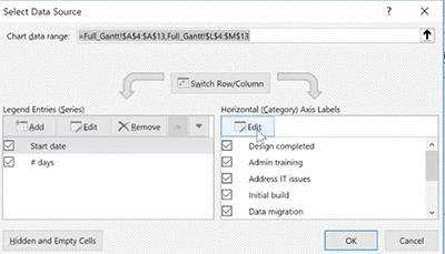
Select cells K5-K13.

Delete the gridlines on the chart.
Now the X-Axis appears properly with the Tasks, the work days required (WD), the % Completed in the bars, and which Scenario is active – either Actual or Plan. When the scenario is changed, the chart updates accordingly.
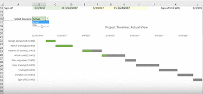
That’s how you create a fully featured and dynamic Gantt Chart in Excel.
Video and Workbook
Feel free to Download the Workbook HERE.

Leila Gharani
I'm a 6x Microsoft MVP with over 15 years of experience implementing and professionals on Management Information Systems of different sizes and nature.
My background is Masters in Economics, Economist, Consultant, Oracle HFM Accounting Systems Expert, SAP BW Project Manager. My passion is teaching, experimenting and sharing. I am also addicted to learning and enjoy taking online courses on a variety of topics.


