Why use a Waterfall Chart?
A waterfall chart or a bridge chart is a way of visualizing your data that helps you understand how you got from one balance to another balance. They are common for financial figures – they allow you to see the profit development – how you got from gross sales to net income or how your earnings developed from last year to this year. But they are also a good story teller for non-financial data.
The Waterfall Chart is also a very liked graph by Management.
For good reason too. It’s a neat way of presenting your data and explaining the factors responsible for the change. But it’s a very difficult chart for many people to create and maintain. It’s one of the most common charts for which people use additional third-party add-ins for.
That was the reason Excel 2016 introduced a built-in waterfall. Extremely user-friendly but unfortunately not flexible.
Featured Course
Black Belt Excel Package

In this video I show you how to use the Excel 2016 standard waterfall chart. How simple and great it is. I also cover it’s restrictions and why I still prefer to create the waterfall chart from scratch. Even in Excel 2016. It obviously involves more steps but it comes with great flexibility. Trust me, creating the waterfall from scratch is not that difficult. Not if you’re using the right technique – I’ll share that with you in future videos.
In case you’re wondering what the disadvantages are, here is an overview of the advantages and limitations of the Excel 2016 built-in Waterfall chart:
Advantages
- Very Easy to Create
- Does not require any special data preparation
Disadvantages
- Chart title cannot reference cells
- Colors can only be controlled via global color scheme
- Connector color cannot be adjusted
- Data Label position is restricted (not possible to have negative data labels to show above)
- No other series can be added to the chart – They are not visible and thus no further customization can be done
- Incorrect display of horizontal axis when cumulative values are negative
- Not all chart functionalities are available
- Objects added to the chart do not stay in the chart
- Plot area can’t be adjusted
- Only works from Excel 2106 (something to keep in mind if sharing workbooks with others)
Getting Familiar with the Excel 2016 Waterfall Chart
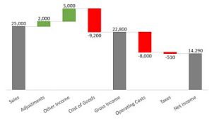
In the first example, we will be creating a Waterfall Chart that shows the variables which influenced the values from sales to net income. The example shows a subtotal in the middle which serves as the gross income. Other than that it shows the values of the change.
| Sales | 25000 |
| Adjustments | 2000 |
| Other Income | 5000 |
| Cost of Goods | -9200 |
| Gross Income | 22800 |
| Operating Costs | -8000 |
| Taxes | -510 |
| Net Income | 14290 |
For some categories, changes are positive and in some cases they are negative. To use the new Excel 2016 Waterfall Chart, highlight the data area including the empty cell right above the categories and Insert > Waterfall Chart.
It will give you three series: Increase, Decrease and Total. At this point you will see the first two, but not the Total. This is because Excel hasn’t figured out which one of your data points are your totals. This is something that needs to be specified by you. What it does figure out by itself is which data points are increases and which ones decreases. It shows these in two different colors.
To specify the Total, double click on the column containing your Total. Do a double click until you get the remaining columns faded out. Only then are you sure that only that particular column has been selected. This is an advantage of Excel 2016. Right mouse click on the column and select Set as total. You will notice the color change corresponding to the Total label. Do the same for the other Totals – i.e. for Gross Income and Net Income.
Adding Some Cosmetic Enhancements to our Waterfall Graph
you can remove the grid-lines just like with any other chart. Remove the legend. In this case you can also remove the Y-value axis. To remove the border of the chart, click on the chart and change the chart shape outline to none.
Yep! That’s how easy it is to create a Waterfall Chart in Excel 2016.
Here is an example where the Waterfall chart can also be used for statistical data.
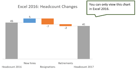
This example shows the change in headcount from one year to the next and includes the factors that influenced it.
Simple right? But what about if you wanted to do some formatting changes such as:
- Change the colors of the chart columns. (e.g. Increase columns to be green and the Decrease columns to be red)
- Data labels on top
- Chart title to reference a cell
- Line Connectors to be in different colors
- Values go on the negative side of the axes – i.e. negative cumulative values
Limitations of the Excel 2016 Waterfall Chart
This takes us to the limitations of the Waterfall Chart. First let’s have a look at the series options by double clicking on the chart. If we take a look at the series options, at first glance it looks similar to all other charts. It has series values, plot area, chart area, data labels and so on.
If you select Values, the gaps in between columns can be adjusted. To increase the distance between bars you can input a number, depending on how wide or how narrow you would want them to be.
Waterfall Connector Color cannot be Changed
There is also an option to show or hide the connector lines. Showing the connector lines helps the reader understand that each change and each category belong to the same story. However, the standard Waterfall Chart does not give you the option to format the shape, color and line style of the connectors. You cannot select a dashed line, nor have the option to set it to a thicker or darker line. But this is a minor restriction.
Waterfall Column Colors are Dependent on the Theme Color
Moving on to higher priority limitations, what if you wanted to color the increases in a different color instead of the default blue? Say for example you want your Increases to be green and Decreases to be red. How can you do it?
Do a single mouse click on the chart and go to Series Options under Format Data Series. You will find that there is something missing. When originally inserting the chart, Excel recognized that our chart had three series and therefore displayed each series in a different color. One color for “increases”, another for “decreases”, and another for the “total” series. However, in the Series Options you only find one single series. This means we can’t format each series differently.
If we select the values series and change the color, it obviously applies that color to the entire series, regardless if it is Increase, Decrease, or Total. So that doesn’t work.
Let’s select one specific column, for example, the Adjustments. Double click it and go to the Series Options and under Fill change the color to another color for example, green. Would that work? Yes but we have now fixed the color of this data point to green. Which means it’s not dynamic anymore. When the value changes to a negative number, the column stays green instead of changing into the color that belongs to our “decreases”.
Where does Excel pick the existing colors from? Let’s take a look at the design options. Under the Design tab, we have a button called Change Colors. When you click it, you have four options where you can fully change the color of the series. The rest are basically different shades of the same series. Where are these color choices coming from? It comes from the Custom Theme Color which is defined under the Page Layout tab. Under Colors you can see that by default the Office Color Scheme is being used.
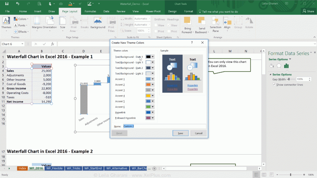
If you go to Customize Color you find that Accent 1 is blue, Accent 2 is orange, Accent 3 is grey, which translates into Increase, Decrease, and Total. These correspond to Series 1, Series 2 and Series 3 in Excel. To change this to the way you want, change Accent 1 to the color you want, say for example, green, then Accent 2 to the red you want, and Accent 3 to the color of your choice. Save this under Custom 2 or you can give it a name and click on Save. Now this should be dynamic. If you change a value in your data table to a negative number, it becomes Series 2 and so it becomes red. But now when you check all the other Waterfall charts on the sheet, you will notice that they have all changed based on the new theme color.
That’s something you need to be aware of if you are changing your theme color to fit your standard Waterfall Chart because by default it’s going to change all your other charts.
If you insert a new chart in the sheet, what color do you think it’s going to be? To check it out, add any chart by going to the Insert tab and selecting a chart. If you add a Bar Chart, you will see that the columns will be green because that’s the new Accent 1 color that was set in the custom theme. If you add a new series to the bar chart, it’s going to be red because that’s the Accent 2 color that has been set. Adding a third series will be in the color gray. The fact that this Waterfall Chart is based on the theme color can be quite a restriction because it does influence the setup of your files.
It is worth noting that we still have some design color options. If you click on the next Waterfall Chart and take a look at Change Colors under the Design tab, there are four different options for the color set. You have the option to select different color combinations. Where are the color sets coming from? It’s again from your theme color. In case you need to have two different Waterfall Charts, you need to update the other Accents from your selected theme color.
Let’s go back to Page Layout tab and select Colors > Customize Colors. You will see the yellow and the blue colors are still there in the current theme. This is where the additional colors from the Design Options are coming from. If you remove the yellow and change it into a darker color you will see the colors of the columns in the Waterfall Chart change.
Unfortunately everything is derived from the theme color which can be a restriction. It would have been great if under the Format Data Series > Series Options you could find the Increase, the Decrease, and the Total Series. This way you could pick the color of each of the series independent to the selected theme color.
Excel Waterfall Chart Title Cannot Reference Cells
The next restriction is the Chart Title. You will not be able to reference cells for the title. I think this must be a bug that appeared with the new set of charts because I can’t see why we shouldn’t be able to control the chart title with a formula just like we can in all other charts.
If you want to use the standard chart title, your only option is to type it in. But then it’s not dynamic anymore. In some situations you might want it to be dynamic, for example, “Net Income Development 2016”, and then next year you want it to read “Net Income Development 2017“. This referencing of the chart title to a cell was a feature that was quite useful which is now unavailable.
A workaround for this is to insert a Textbox which you can reference to cells. Go to Format tab and click on Textbox and add it to your chart. You just have to make sure that you’re not typing in the Textbox but rather, you click on the edge and then you type “=your reference cell” directly in the formula bar. For example, you would type =A1 to use cell A1 as your reference.
Now we face another problem that we don’t face with the other charts. The Textbox is independent to the chart so you can pretty much move it anywhere. Even if you add the Textbox by first activating the chart, it is still independent of the chart. If you want to have the Textbox fixed together with the chart, you can do this by clicking on the Textbox, hold down the Control key and then click on the chart, right mouse click and group them together as one by selecting Group > Group. This is something that doesn’t need to be done with normal charts because Textboxes or any shapes that are inserted in the chart always stay in the chart. You do not need to group these together.
Excel Waterfall Data Labels are Not Flexible Enough
Let’s move on to the data labels. I generally have my data labels sitting on top, for positive and negative values. I find that people can read it better this way. They look at all the values and then they see the amount and the shape/extent of the change. It gives the chart a consistent look.
Looking at the options that we have for the data labels under the Format Data Labels > Label Options > Label Position, we can position the labels on the Outside End, Inside End, Center, and Inside Base. But you will not find an option to place the labels Always on top. Normally, when I design charts and I want to fully control the data labels, I add a new series to the chart, make it invisible and then activate the data labels for that invisible series and connect them to the values.
Additional Series Cannot be Added to the Chart
Another restriction is that with the Excel 2016 standard Waterfall, you can’t add any other series to the chart that you can control. Let’s test this by adding the same series to the chart. Right-mouse click on the chart and Select Data. You will see that in the Select Data Source window the Add button is enabled. For the Series Name, type in “Newseries”. Under the Series values, highlight the values only and click on OK. Until now it seems that it all worked fine. Now check if you can find the new series under the drop-down for the chart elements in Series Options. Well, it’s not there.
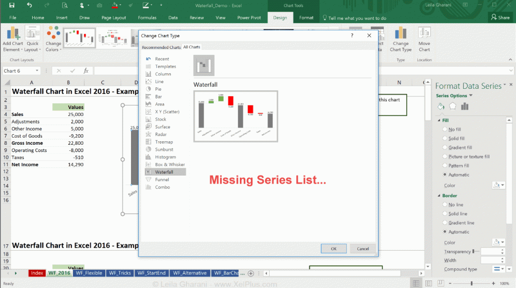
Go to Design > Change Chart Type and you will also notice that the new series is not there. Generally, in the Change Chart Type window, you should be able to see all the series listed below the Waterfall image and you should be able to change the chart series type of each of them individually. However, this setup doesn’t allow you to do that. The “Newseries” is basically invisible. This is the next disadvantage —that you cannot add additional series to the chart and get your customized version of the Waterfall Chart.
Negative Cumulative Values are Not Probably Shown in the Waterfall Chart
The next restriction is how it handles the data when your series moves to the negative side. Say for example, for Operating Costs, instead of -8,000, change it to -25,000. You will see a shift in the chart columns that is confusing. At first glance, it looks as though the Operating Costs column sits above 0 but it’s not because the end value is about -2000. It’s the behavior of the x-axis that causes the confusion. The line moves down below all the columns, so the y-axis no longer crosses the x-axis at zero.
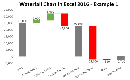
Let’s have a look at the options for the axes under the Format Axis > Axis Options section. You will notice that there is nothing in Axis Options that we can control to fix this. You can only control Tick Marks and the Number options and that’s it. Under Fill and Line there are options to select to show No line. It would still end up confusing because the chart still doesn’t have a line for the zero x-axis.
In the Y-axis options, Axes > Primary Vertical, there is also no setting the we can use to fix this. If your cumulative values can be negative, the existing Waterfall Chart will not represent them correctly.
Missing Chart Functionalities in Excel Waterfall Chart
Another restriction that you’ve probably noticed by now is that not all chart functionalities are available. On the axis side there are missing Axis Options and Axis Labels. If you go back to any other Excel chart – for example the standard column chart, and click on the chart Axis Options you will see it has a lot more options than what is available for the Standard 2016 Waterfall Chart. The missing functionalities are not just for the axis options but also for the other chart options. Under Format Data Series > Series Options you will find options for the Gap Width but you will not be able to select “secondary axis” for example. In addition, we’re fully missing any new series that we add to this chart.
Waterfall Chart only Readable in Excel 2016
The last more obvious restriction is that the Waterfall chart can only be viewed by persons who have Excel 2016. If you are planning to send your files to others, you need to make sure this is the case, otherwise they cannot view the chart. This is what they see:
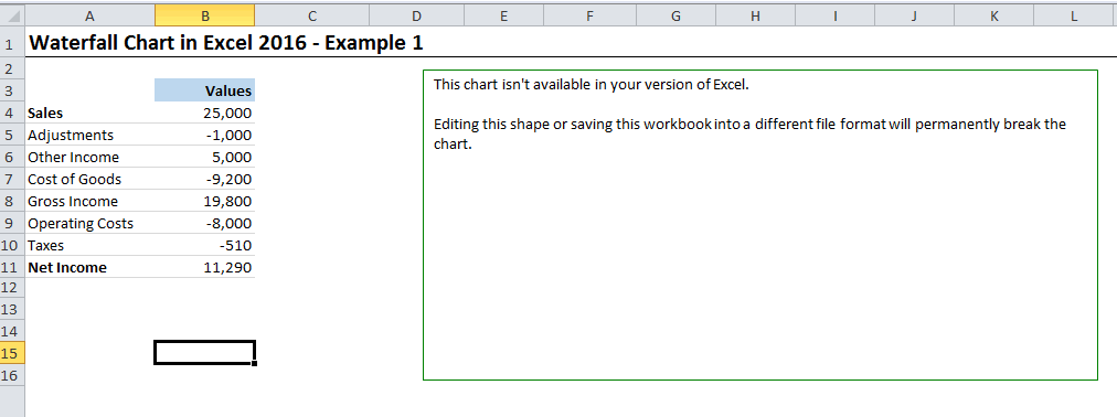
You don’t have this problem, if you create the Waterfall from scratch.
Creating the Waterfall Chart from Scratch
Sure, it’s more work than the built-in Waterfall Chart, but you have the flexibility to change every aspect of the chart. In the next article I’ll show you a simple way to create the Waterfall Chart from scratch.
Leila Gharani
I'm a 6x Microsoft MVP with over 15 years of experience implementing and professionals on Management Information Systems of different sizes and nature.
My background is Masters in Economics, Economist, Consultant, Oracle HFM Accounting Systems Expert, SAP BW Project Manager. My passion is teaching, experimenting and sharing. I am also addicted to learning and enjoy taking online courses on a variety of topics.


