How to Create the Easiest Waterfall Chart from Scratch
If you deal with Waterfall charts you know it takes a lot of data manipulation to make the chart work, especially if you need to show changes that go below the horizontal axis – i.e. your cumulative values become negative.
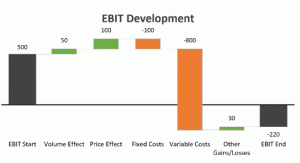
Let me guess. Are you using stacked columns? If yes, then I know what you’re going through. It’s not nice.
Now I will tell you, you never have to use stacked columns again. There are two “secret” techniques you can use to get a super flexible waterfall chart with minimal effort.
Why do I call these techniques “secret”? Well, because in every seminar I’ve given, the participants had NEVER heard of or used these techniques. You might think they are hidden or difficult to find, but they are not. They are sitting right there with all other chart features but most people don’t use them because they don’t think they are useful for the graph they’re making.
I completely ignored them for many years, until one bored evening, I decided to take a deeper look at how these features could be put to valuable use in charts. Not just for the Waterfall, but any other chart that is “difficult” or “impossible” to make in Excel.
Watch the video to see how they can be used to create the easiest Waterfall chart from scratch!
DOWNLOAD WATERFALL CHART WORKBOOK HERE!
Featured Course
Black Belt Excel Package

Step by Step Guide to Create the Waterfall From Scratch
First of all, save this image or print it out and keep it handy. You’ll need it when you come to actually create your Waterfall on the job. As much as everything might make sense now, you’ll be surprised how easy it is to forget the steps, especially if this is not a chart you make on a regular basis.
Also make sure you download the workbook. The chart setup will make more sense if you follow the steps. You can also use the workbook as your Waterfall Chart template.
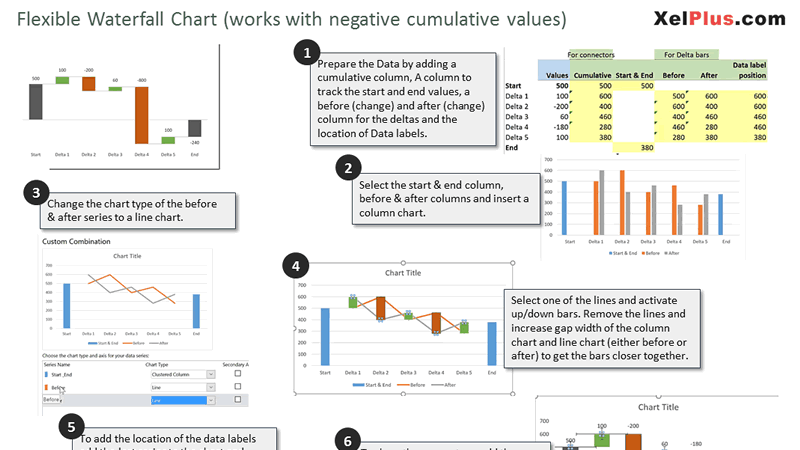
You forgot the steps to create the Waterfall Chart from scratch? Save this Cheat Sheet to help you remember the steps.
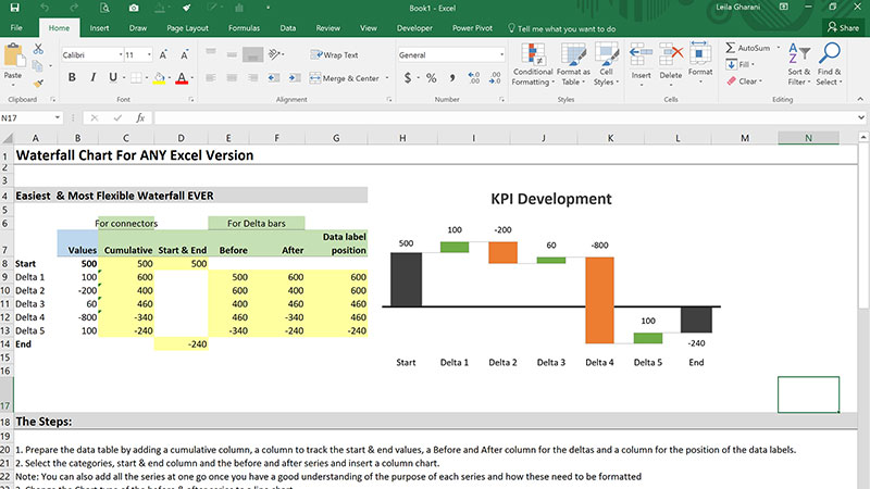
Download this Excel Waterfall Chart template and type in your own labels and data. Try to backtrack to see how it’s setup.
Let’s have a look at the techniques used to create the Waterfall chart and then let’s lay out the type of series and calculations necessary to create our chart.
Technique #1: Line Series For the Deltas With Up/Down Bars
The delta bars are in fact created by drawing two line series and then activating a chart feature called Up/Down Bars. What Up/Down Bars do is they connect the first point/position on the first line series with the first point on the second line series. You need to have two line series to be able to activate these.
What are Up/Down Bars actually used for? For graphs that show candlestick formations – i.e. they have a low end / high. They are commonly used to visualize price movements for trading.
Our Waterfall has nothing to do with trading but we’re going to use Up/Down bars as our deltas. To get them to do what we want, we need to plot a point before the change occurred and a point after the change occurred. We’ll do that for every single of the delta categories. This means we have a chart that has two lines, “before the change” and “after the change”.
Before we get to our data table let’s consider this: For every series we’d like to add to the Waterfall, we need a separate column in our data table. This means:
- Before series is separate to After
- Start & End series can be together in one column for which we can use a standard column chart.
- Cumulative series can be added to check the cumulative value at each stage in time. It’s good to know and it can simplify some of our other formulas. Plus we’ll need it later for our connectors.
Let’s calculate:
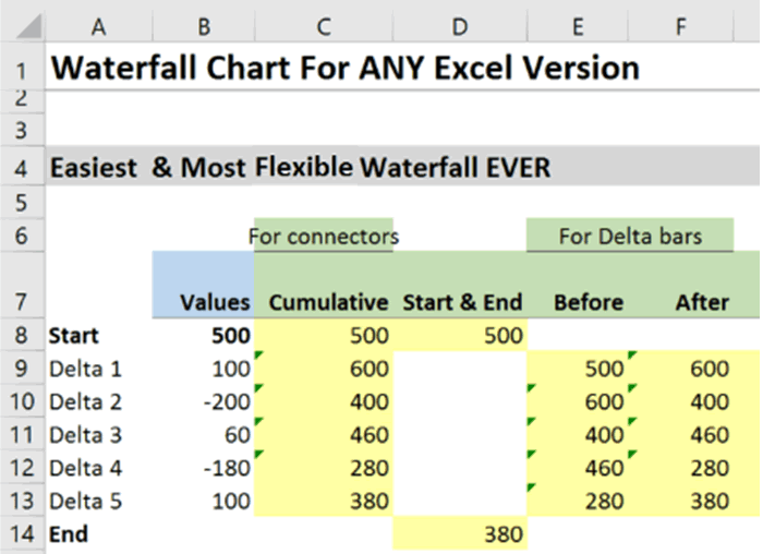
Cumulative series is =SUM($B$8:B8) → written in C8 and pulled down till C13.
Start value (D8) =B8
End value (D14) =C13
Before series =C8 → written in E9 and pulled down to E13 (covers all the deltas)
After series = C9 → written in F9 and pulled down to F13 (covering all the deltas)
Now that we’ve set up the data, let’s start with our Waterfall.
Select A7 to A14, hold down the control key and highlight D7 to F14. Notice you’re including the headers and the empty cells below the deltas. The headers help Excel identify that you’re adding new series and by highlighting the empty cells below the deltas you remain consistent with your categories. As smart as Excel is, you need to be consistent with your ranges, otherwise it will assign the wrong value to your Deltas.
At this point, your Waterfall looks like this – no worries, we’re just a few clicks away.
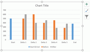
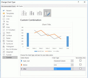
Select either the Before or After series, right-mouse click and Change series chart type….
Stay in this view and change the chart type of Before and After series to a Line.
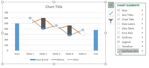
Now click on either of the lines, go to the Plus button on the top right hand corner of your Waterfall chart and place a check-mark for Up/Down Bars.
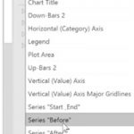
You get two new chart elements added. One is called Up-Bars and the other Down-Bars. You can see them by clicking on the drop-down box to view all chart elements. In our Waterfall, the Up-Bars show positive change, whereas the Down-Bars show negative change. We can color them the way we want, so green for Up and in my case, orange for Down. They come with borders, but don’t worry about them at this stage.
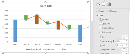
To remove the lines, click on the Before series and select No line from the Fill Options. Do the same for the After series.
How do we get the Delta Bars Closer?
It’s easy to solve this for the Start & End series. Select this series from the chart element selection and reduce Gap Width to a number of your liking. I’ve used 100%. Now when you try to do this for the Up/Down bars, you will realize there is no Gap Width option. That’s because the option is sitting with the original series which was the line series. From the series options, select either the Before or After series and reduce the Gap Width to a 100%.
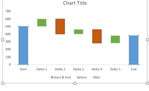
Now it’s starting to look like a Waterfall Chart.
Technique #2: Customizing Data Labels
What we’d like to have is to get the amount of the deltas to sit on top of the bars. This means we’d like to have a value of 500 sitting on top of the Start bar, then 100 on top of the green bar and -200 on top of the red bar. How can we achieve that?
The moment there is a discrepancy between the “position” of the data label and the “value” that label shows, we need to use a special technique. But first of all, let’s check if there are any discrepancies.
Start – Position: 500, Value: 500 → Match
Delta 1 – Position: 600, Value: 100 → No Match
Delta 2 – Position: 600, Value: -200 → No Match
….. No Matches until End
End – Position: 380, Value: 380 → Match
We have a match for Start & End series. This means we can activate the data labels for this series without problems.
What to do with the Deltas?
We need a series that plants points in the right positions, i.e. a series that has 600 for Delta 1, 600 for Delta 2, 460 for Delta 3 & Delta 4, and 380 for Delta 5.
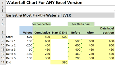
That brings us back to our data table. There are of course different ways of writing this. We can use an IF() function and check if our Delta is positive, in which case we take the After value, otherwise the Before value. OR we take a shortcut and get the MAX() of Before and After.
Formula for cell G9 would be = MAX(E9:F9) and pull this down to G13.No we have the correct position. Let s add this to our Waterfall Chart as a scatter plot. This means you need to:
- Right-mouse-click on your graph and Select Data.
- Click Add – pick cell G7 as your series label (always make sure your series have labels so you can easily identify them in the series options) and range G8:G14 as your Y range. Remember: Be consistent. Just because you have numbers for the Deltas, doesn’t mean you ONLY select the numbers. You need to be in sync with your categories, otherwise you place the Delta 1 number on the Start category.
- At this point it might look like you’ve ruined your Waterfall. Excel has added another line chart and is using that for the Up/Down bars. Don’t panic. Just right mouse click on any series and go to the Change Series Chart Type…
- From the Change Series Chart Type… options, find the Data Label Position Series and change it to a Scatter Plot.
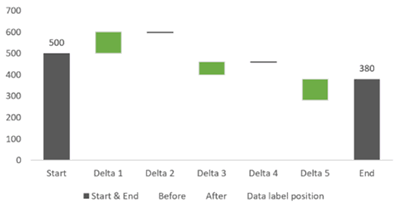
Now things look better again
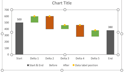
Click on the Data Label Position Series or select it from the Series Options. Activate data labels and position these on top. Now hide the markers. You can do this by selecting No Marker from the fill options or by selecting No Fill and No Outline from the formatting options (I usually have these two in my Quick Access Toolbar).
Are these the labels we want? No! They are the position of the series and not the value of the deltas.
We have two options now to replace the labels with our delta values
Option 1: Click on each data label and type a formula in the formula bar that references the value for the delta. So for Delta 1 data label, you click on the label, then go to the formula bar and type in =B9. Excel does the fixing for you.
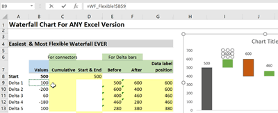
Option 2: Select the data labels and from the data label options put a check-mark for Value From Cells. You get a pop-up at this stage and you can highlight B8 to B14. Remember be consistent. Even though we don’t need the value for Start and End, we need to respect the category order.

Which Option is better?
That depends on which version of Excel you have and which version of Excel your colleagues who might work will your file have. The formula referencing method is obviously more time-consuming but it’s compatible with older versions of Excel e.g. from Excel 2007 and Option 2, i.e. the Value From Cells method is compatible from Excel 2013.
Technique #3 – Error Bars as Connectors
I’m pretty sure economists didn’t think of error bars as cosmetic enhancements to charts, but it does a great job for our Waterfall.
A scatter plot can have both X and Y error bars associated with each point – i.e. a range of possible error which is shown as capped lines in Excel. If we manage to plant a point at the “end “ of each of the bars and activate the right-hand side of the error bars only, we’ll get our connectors.
To “add” error bars to our chart, we first need to add a series for which we can activate the error bars for. This series should always sit at the “end” of the bars, which means we can use the cumulative series for this purpose. Follow these steps:
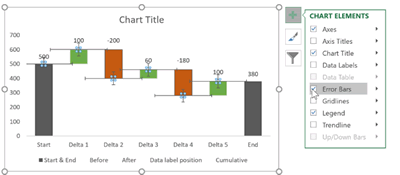
- Right-mouse-click on the chart and Select Data.
- Add a new series. Pick C6 as the label “for connectors” and select C8 to C14 as the Y values.
- The chart type is already a scatter plot. Why? Because that’s the series we had last. Remember – for the data labels.
- Now we just need to activate the error bars. Select the newly added series, click on the plus sign on the top right-hand corner of the Waterfall chart and put a check-mark for Error Bars.
- We don’t need the Y error bars. Click on one of them to select or select them from the series options and press the Delete button on your keyboard.
Double click on any of the horizontal error bars to bring up the options. Here is what we’ll see:
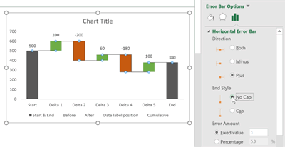
Now to make sure we make the right choice for Direction, always take a look at your marker and the point you see in the picture. Think about which direction you want the line to go. In this case, we need it to be a Plus.
For End Style, select No Cap to remove the tick mark at the end of the line.
Who decides how long the line is? It’s the Error Amount. Here you have a lot of options at your disposal, but we just need the first one and that’s to type a 1 for Fixed value. The reason this works is because the distance between each category is 1. That’s how Excel translates category spacing for the scatter plot – side note: remember scatter plot needs numbers for X and Y – if you leave X empty, Excel is nice enough to fill it with 1, 2, 3, etc for each category. – Doesn’t work for Y but it does for X).
The rest is cosmetic enhancements. Click on color options for the X error bars and change the line color to a subtle grey. We’re nearly there, but it’s still not fully “right”. Notice how the connector line “sits” on top of the other bars. It doesn’t flow well.
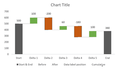
To improve the flow, do the following:
- Add the same color border to the Start/End series and the Up, then the Down bars.
- Remove the Y-axis. Just click on it and press Delete.
- Remove the legends on the bottom and the Gridlines if you haven’t done so by now.
- Add a Title.
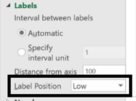
- To make sure your category axis labels move down if your cumulative values become negative, go to the X-axis options and for Label Position, select Low.
Test it out by putting in a large negative change that pushes your cumulative into the negative.
Now we’re all set with our super flexible Waterfall chart!
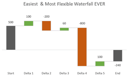
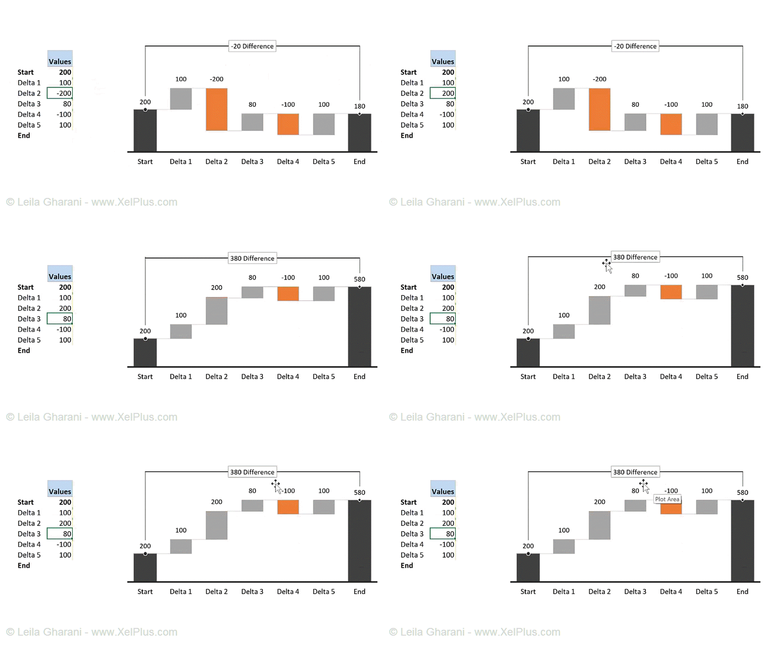
In my Ultimate Waterfall Chart Course I show different combinations of the techniques to create any type of Waterfall chart you’d like to include in your Management Reports. The Vertical Version of the Waterfall Chart is also included.
One example is this:
The following table summarizes the Advantages and Disadvantages of creating the Waterfall chart from scratch:
Advantages
- You have control over every aspect of your Waterfall – this is where the new Excel 2016 Waterfall falls short
- Assign own connector color and type
- Position the data labels wherever you like
- Choose your own colors
- Adjust axis and category labels as you prefer
- Works perfectly well with negative cumulative values
- Compatible with any Excel version
Disadvantages
- Requires data preparation and multiple series
Leila Gharani
I'm a 6x Microsoft MVP with over 15 years of experience implementing and professionals on Management Information Systems of different sizes and nature.
My background is Masters in Economics, Economist, Consultant, Oracle HFM Accounting Systems Expert, SAP BW Project Manager. My passion is teaching, experimenting and sharing. I am also addicted to learning and enjoy taking online courses on a variety of topics.


