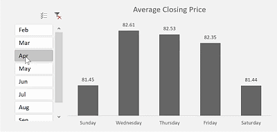
WEEKDAY() function
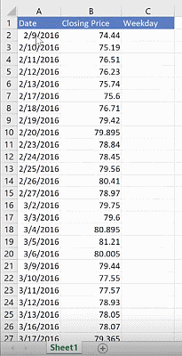
The data table contains daily closing prices spread across various months. Since we want to show the closing price for each weekday, we use Excel’s WEEKDAY() function to convert the date in column A into days of the week.
The serial number argument is the date you want to convert. For the first row, this is the date in cell A2. The formula is written as:
Cell C2 =WEEKDAY(A2,…)The return type argument in this function lets you choose the convention of numbering days in a week by indicating what day the week starts. You will see a dropdown list of your options, which are:
- 1 – Numbers 1 (Sunday) through 7 (Saturday)
- 2 – Numbers 1 (Monday) through 7 (Sunday)
- 3 – Numbers 0 (Monday) through 7 (Sunday)
- 11 – Numbers 1 (Monday) through 7 (Sunday)
- 12 – Numbers 1 (Tuesday) through 7 (Monday)
- 13 – Numbers 1 (Wednesday) through 7 (Tuesday)
- 14 – Numbers 1 (Thursday) through 7 (Wednesday)
- 15 – Numbers 1 (Friday) through 7 (Thursday)
- 16 – Numbers 1 (Saturday) through 7 (Friday)
- 17 – Numbers 1 (Sunday) through 7 (Saturday)
By default, Excel’s week starts on a Sunday. If you want it to start on a Monday, for example, you should use 2 as the return type.
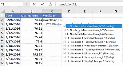
To see how this works, use the WEEKDAY() function for 2/9/2016 in cell A2 using a week that starts on a Monday:
Cell A2 =WEEKDAY(A2,2)This results to a 2 since 2/9/2016 falls on a Tuesday. Changing the return type of the WEEKDAY() function to 1, gives you a weekday number of 1 instead of 2.
In this report, instead of the weekday numbers, we want to display the weekday names so that it displays as Sunday, Monday, and so on. To change the weekday number to a name, you can use Excel’s custom formatting. To do this:
- Left click on the cell containing the weekday number.
- Click on CTRL + 1 and that will display the Format Cells window. Alternatively, you can go to the HOME tab and click on the dropdown button in the Number section. Select More number formats and that should bring you to the Format Cells window as well.
- Under Category, select Custom.
- Under Type, use “dddd”. This will show your weekday as “Monday”, “Tuesday”, and so on. If you want to abbreviate the weekday to the first three letters such as “Mon”, “Tue”, etc, use “ddd” instead.
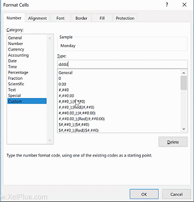
However, you will notice that instead of displaying “Tuesday” in cell C2, it gives you “Monday”. This is because Excel’s custom formatting uses the default week convention which starts with a Sunday and the number 2 is a Monday. To fix this, change your return type to 1 instead of 2 so that the week starts on Sunday:
Cell A2 = WEEKDAY(A2,1)This now gives you the correct weekday name. Drag the formula down to the last row of your data table.
As an alternative, you can also use the TEXT() function which is written as:
Cell C2 = TEXT(A2,”dddd”)This eliminates the step of selecting the return type and custom formatting like above and still gives you the same result.
Converting data into an Excel table
To create a PivotChart, you need to have a PivotTable. Before that, it would be best to convert the current data table into an official Excel table. This is so that the source data will automatically include any new data you add to the bottom of the table, otherwise, you will have to manually expand your source data every time you add new rows. This allows the report to be easily updated.
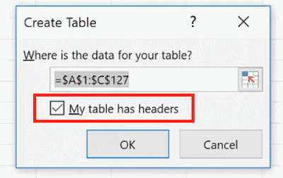
Click on any cell in the data table press on CTRL + T. A window will popup asking for the location of the table and if it has headers. In this case, the table already has headers so make sure you tick that box so that it does not add a new row for the header.
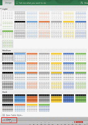
To format the table, go to the Design tab and click on the dropdown button under Table Styles where you can select the style you want, or click Clear if you want to retain the default look.
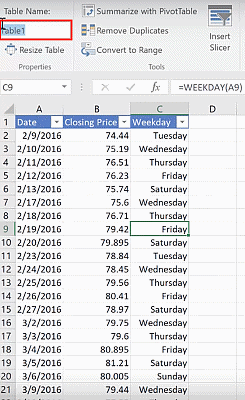
You also have the option to rename the table. You can find this at the upper left hand corner under the Design tab. Rename the table to “prices”.
Inserting a PivotTable
To insert a PivotTable from the data table:
- Click anywhere in your data table and go to the Design.
- Click on Summarize with PivotTable. This will show you the Create PivotTable window.
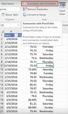
3. Under the Table/Range write down the name of the table which is ”prices”.
4. You have the option to select where the PivotTable will be placed. In this example, select Existing Worksheet and select cell E1.
5. On the right side, you will see the PivotTable fields. Tick “Weekday” and “Closing Price” since we want to display these. The “Weekday” field should be under Rows, and the “Closing Price” under Values.
You will notice that under the Values area, it shows as “Sum of Closing Price”. But, instead of the sum, we want the table to summarize the average closing prices. To change this:
- Click on the dropdown button.
- Select Value Field Settings.
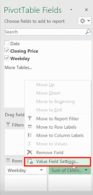
3. In the dropdown list, select Average.
4. To make the format across all tows uniform, select Number Format. Under category, select Number and choose a format in the list and the number of decimal places.
5. Click on OK.
You will now have a PivotTable that summarizes your data according to weekday.
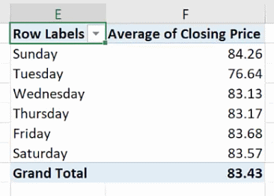
Creating a PivotChart
We want the report to include a graphical representation using a PivotChart. Click on the PivotTable, go to the Analyze tab and select Pivot Chart.
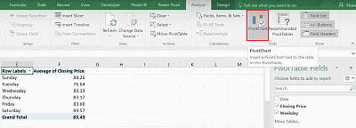
There will be many options for the visual layout. In this example, select the Clustered column. This inserts a new PivotChart on the worksheet.
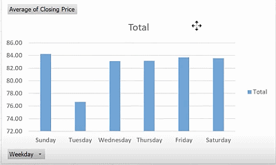
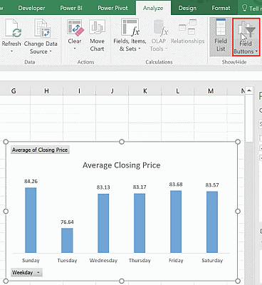
Remove the elements that you will not be using and add those that you would want to be shown. In this example, I have removed the legend and the vertical axis markers, and added data labels. To add data labels, right click on the PivotChart and select Add Data Labels.
Rename the title to “Average Closing Price”. You will also notice that there are buttons on the PivotChart. You can remove this by going to the Analyze tab and clicking on Field Buttons to toggle them off.
Adding a slicer
At this point, the PivotChart is not yet interactive. We can fix this by adding a slicer where the user can select which months to gather data from. Under the Analyze tab, select Insert Slicer. The fields that can be displayed on the slicer are the fields from your PivotTable: Date, Closing Price, and Weekday. Since we don’t have the Month option, tick on the Date field.
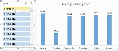
You will notice that the slicer displays the dates. Clicking on a date shows you the closing price of that specific date. However, we want the chart to summarize the closing prices for each weekday depending on the selected month. For now, delete this slicer and go back to the PivotTable.
In the PivotTable Fields window, tick on the “Date” field. Notice that doing so automatically adds the “Date” field under the Row area, along with a new field, “Months”. This allows you to group the data by month.
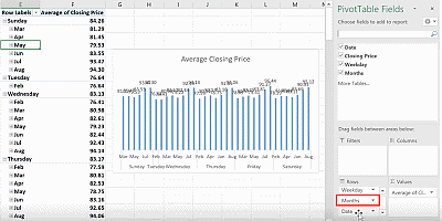
Since you don’t need to display the “Date” and “Months” fields in your PivotTable, remove the tick marks. While the “Months” field is not displayed in the PivotTable, it has already been added as a new field which you can now use in the slicer. If you are using an old version of Excel, which does not automatically add the “Months” field, go to the PivotTable and group the dates by month.
Adding a slicer will make both PivotTable and PivotChart interactive. Since both are linked, you can bring in the slicer either through the PivotTable option or the PivotChart tool options. Under the Analyze tab, select Insert Slicer. You will see that you now have the Months option to display on the slicer.
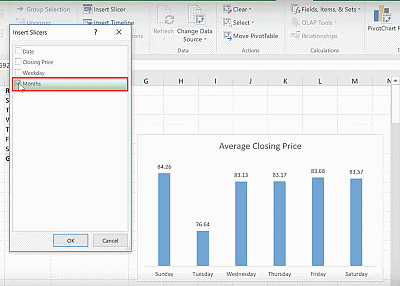
When a month is clicked, both the PivotChart and PivotTable show the average closing prices for each weekday. To select multiple months, hold CTRL and select the months to be displayed.
There will be grayed out months at the bottom of the slicer which indicates the months that do not have data in.
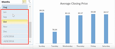
If you want to remove the empty months, click on the slicer, head to Options > Slicer Settings. Tick the option to hide items with no data.
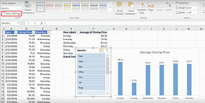
You can also change or remove the caption on the slicer as per preference.
Formatting the report
There are various ways to format the overall look of the report. This includes changing the colors, font and the gap width of the PivotChart bars. These are the changes I have done in this example:
Worksheet
- Change the cells behind the slicer and PivotChart to light gray.
PivotChart
- Reduce the PivotChart Gap Width to 100%
- Change the bar colors to dark gray.
- Remove the shape fill and border.
Slicer
- Use Slicer columns = 1. You can use multiple columns to display the options horizontally instead of vertically.
- Use a custom gray theme under Slicer Styles.
To make a custom slicer style:
- Right click on the closest gray style and click Duplicate.
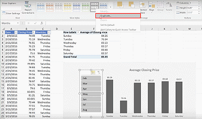
2. Rename the new theme to “priceslicer”.
3. Under the Slice Element, select the Whole Slicer and click Format.
4. Remove the border.
5. Under Fill, use a color that is identical to the light gray background color used in the worksheet.
6. Click on OK.
You will notice that after creating the slicer style, there is no change to the slicer. This is because it is still using the old slicer style. Click on the slicer and select the newly created custom style under the Slicer Styles.
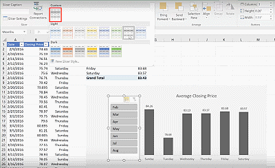
Test out the report by adding new rows to the data table. To quickly go to the last row of the data table, press CTRL + down arrow. The data we currently have are up until August. Add new data rows for the month of September. Right click on your PivotTable and select Refresh. This allows it to capture any changes to the data table. You will see that the month September is now displayed in the slicer.
Feel free to Download the Workbook HERE.

Leila Gharani
I'm a 6x Microsoft MVP with over 15 years of experience implementing and professionals on Management Information Systems of different sizes and nature.
My background is Masters in Economics, Economist, Consultant, Oracle HFM Accounting Systems Expert, SAP BW Project Manager. My passion is teaching, experimenting and sharing. I am also addicted to learning and enjoy taking online courses on a variety of topics.


