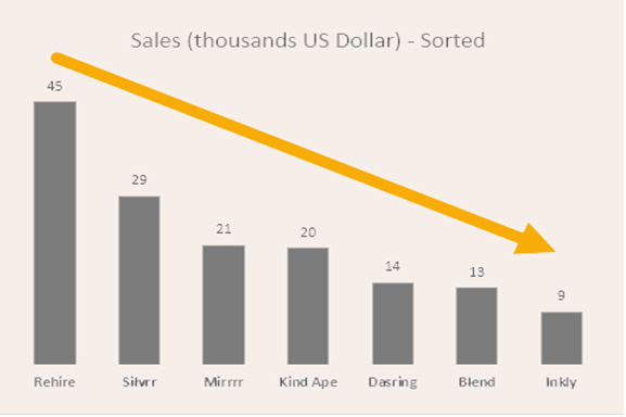
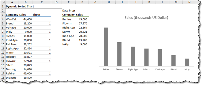
Our dataset is comprised of three columns that display company name, sales, and a third column that indicates the display status of the record.
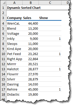
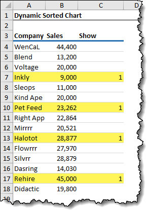
Placing a “1” in the “Show” column indicated that we wish to display the company in the chart. Leaving the “Show” cell blank implies that we want to hide the company from the chart.
The great thing about this approach is that adding a company to the chart only requires placing a “1” in the corresponding Show” cell; no need to update complicated chart ranges.
Don’t forget, as a bonus we will sort our chart based on the “Sales” of the selected companies.
Our Knight in Shining Armor to accomplish all of this will be to use some of the new Dynamic Array functions offered in the Office 354 edition of Excel.
Setting Up the Middle-Man Table
Whenever you find yourself basing a chart on some extended logic that is not part of the original data’s table, it is a good idea to create what we’ll call a data preparation table to rework the original data into a new data set that the chart will look towards for input.
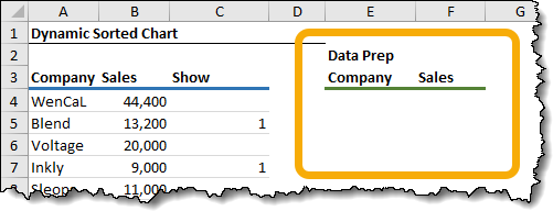
This new data preparation table will be restricted to only show company and sales for records that contain a “1” in their respective “Show” column.
Dynamic Array FILTER Function
To build the list of selected company names, we can use the FILTER function to create a list of companies where the “Show” cell is set to “1”.
The FILTER function’s first argument is what array we are filtering. We could select the entire set of company names and related sales (A4:B18) but we will take a different approach.
Our first function will only select the list of company names for two reasons:
- We can’t always guarantee that our needed columns for the chart will always be side-by-side in the source data, and
- We want to keep the results separate so we can create dynamic ranges for our chart.
We start by using FILTER to select the list of company names.
=FILTER(A4:A18Now we tell FILTER that we only want to include companies that have a “1” in the “Show” column.
=FILTER(A4:A18, C4:C18=1)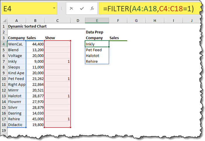
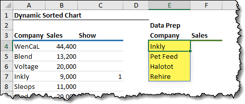
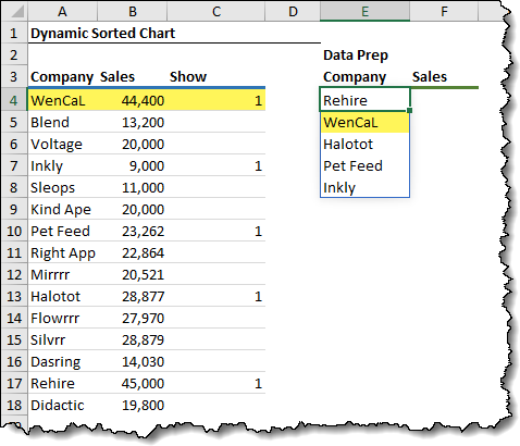
The resulting spilled array of results is as follows.
Dynamic Array SORT and SORTBY Functions
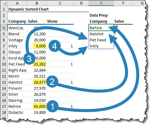
We want to sort the results of the FILTER function in descending order by their respective sales.
We have two new Dynamic Array functions that aid with sorting: SORT and SORTBY.
We are going to use the SORTBY function because it allows us to sort our results based on data that is not contained in the result.
Since sales are not included in our result (we’re going to use a separate function to find those values), we’ll use SORTBY to sort our selected companies based on their related sales.
The updated function starts changing as follows:
=SORTBY(FILTER(A4:A18, C4:C18=1)We are telling the SORTBY function to sort the original list.
Next, we tell SORTBY to sort the original results of FILTER by looking at a FILTERed list of sales based on the same criterion used to filter the company names.
=SORTBY(FILTER(A4:A18, C4:C18=1), FILTER(B4:B18, C4:C18=1)NOTE: The second argument of SORTBY must be the same size as the first argument.
Lastly, we tell SORTBY to sort the list in descending order (-1).
=SORTBY(FILTER(A4:A18, C4:C18=1), FILTER(B4:B18, C4:C18=1), -1)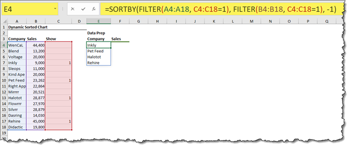
We now have the filtered company list sorted based on their sales.
Testing the Logic
If we add a “1” to one of our hidden companies (ex: Wencal), the filtered list automatically updates to include the newly selected company, and the list remains sorted in descending order by sales.
Creating the Sales List
The next step is to locate the sales for the selected companies in our data preparation table.
We could use the amazing new XLOOKUP function, but just for nostalgic reasons, we’ll use the tried and true VLOOKUP function.
In the data preparation table next to the first returned company, we enter the following VLOOKUP function:
=VLOOKUP(E4#, A4:B18, 2, False)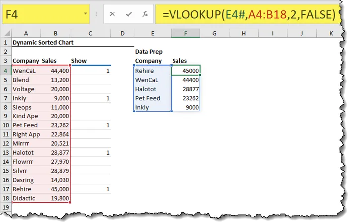
NOTE: If you are unfamiliar with Dynamic Array Notation, the #-sign next to the A4 reference is to tell VLOOKUP to repeat the VLOOKUP for the entire spilled array.
Applying a bit of cosmetics
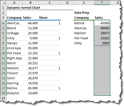
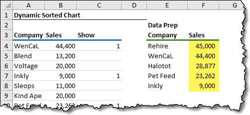
To make the results of the sales more visually appealing, we will highlight the largest range of cells we expect the result to appear and we’ll format the cells with a comma style with zero decimal places.
Running Another Test
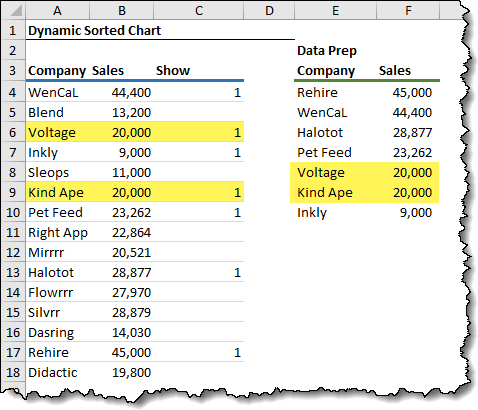
If we add a “1” to a currently non-displayed company (ex: Voltage and Kind Ape), we see the data preparation table updated to include the new company as well at the company’s sales.
Also, notice that the data preparation table remains sorted in descending order by sales.
Creating the Dynamic, Filtered, Sorted Chart
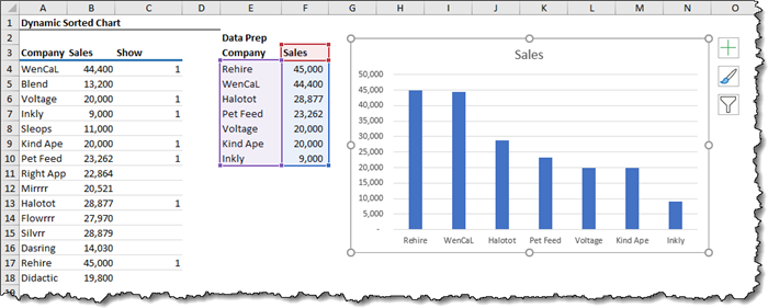
We begin by selecting the data preparation table (E3:F10) and select Insert (tab) -> Charts (group) -> 2D Clustered Column chart.
The problem with static ranges
Because the chart is “looking” at cells E3:F10 for its data, if we remove a 1 from the “Show” column in the source data, the data preparation table is reduced by one entry, but the chart continues to display a placeholder slot for the missing company.
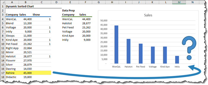
The chart doesn’t know to ignore the blank row; it continues to display the contents of the defined cell regardless if the cells are empty or filled.
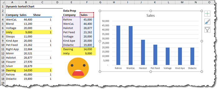
Likewise, if we “Show” more companies than we have allotted for in the chart, the chart will not display any companies beyond the originally defined static range.
Creating a Dynamic Chart Range
A lesser-known ability of charts is that not only can they accept direct references for their data (i.e. Sheet1!$A$1:$C$10), they can also accept named ranges.
At present (March 2020), charts are not able to take advantage of the spill-range reference notation of dynamic arrays, like A1#. However, Named Ranges can accept these spill range references.
We’ll set this up by creating a Named Range that points to a spilled array.
Select Formulas (tab) -> Defined Names (group) -> Name Manager.

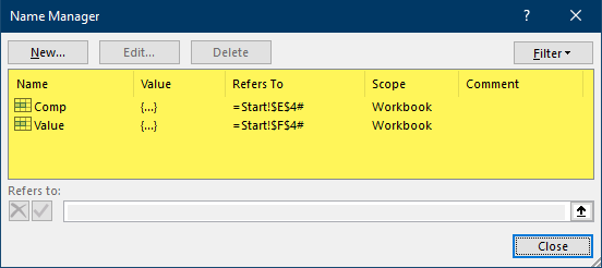
In the Name Manager dialog box, we will create two named ranges: one for the company name list and the other for the sales. These named ranges will be used by the chart to recognize where the chart data lies.
To create the reference to the company names, select New then input the following parameters in the New Name dialog box.
- Name: Comp
- Refers to: Start!$E$4#

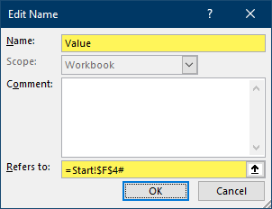
Next, create the reference to the company sales by selecting New then input the following parameters in the New Name dialog box.
- Name: Value
- Refers to: Start!$F$4#
Updating the Chart References
The next step is to reprogram the chart to look at the newly created named ranges instead of the static cell references as previously programmed.
- Right-click the chart and click “Select Data…”
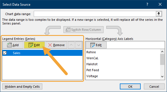
- In the Select Data Source dialog box, click the “Sales” entry in the “Legend Entries (Series)” zone and click Edit.
- In the Edit Series dialog box, change the “Series values:” field by deleting everything to the right of the exclamation mark and replacing it with the named range “Value”.
=Start!Value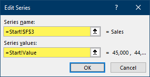
- In the Select Data Source dialog box, in the “Horizontal (Category) Axis Labels” zone, click Edit.
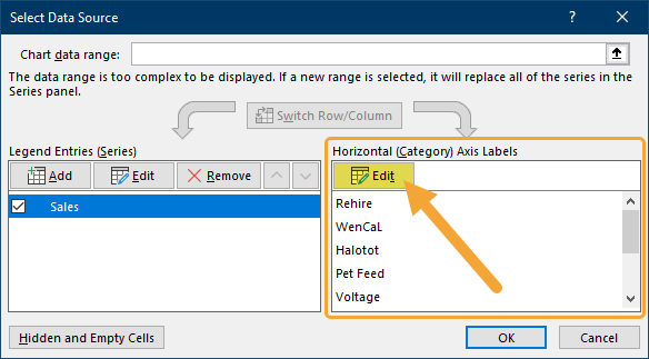
- In the Axis Labels dialog box, change the “Axis label range:” field by deleting everything to the right of the exclamation mark and replacing it with the named range “Comp”.
=Start!Comp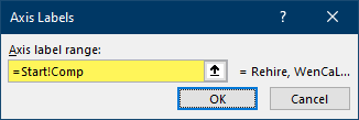
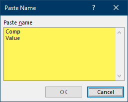
NOTE: If you don’t remember the names you assigned in the Name Manager from earlier, a shortcut is to press the F4 key (in steps 3 or 5) to reveal a Paste Names dialog box that will present a list of all named ranges.
Testing the Updated Chart
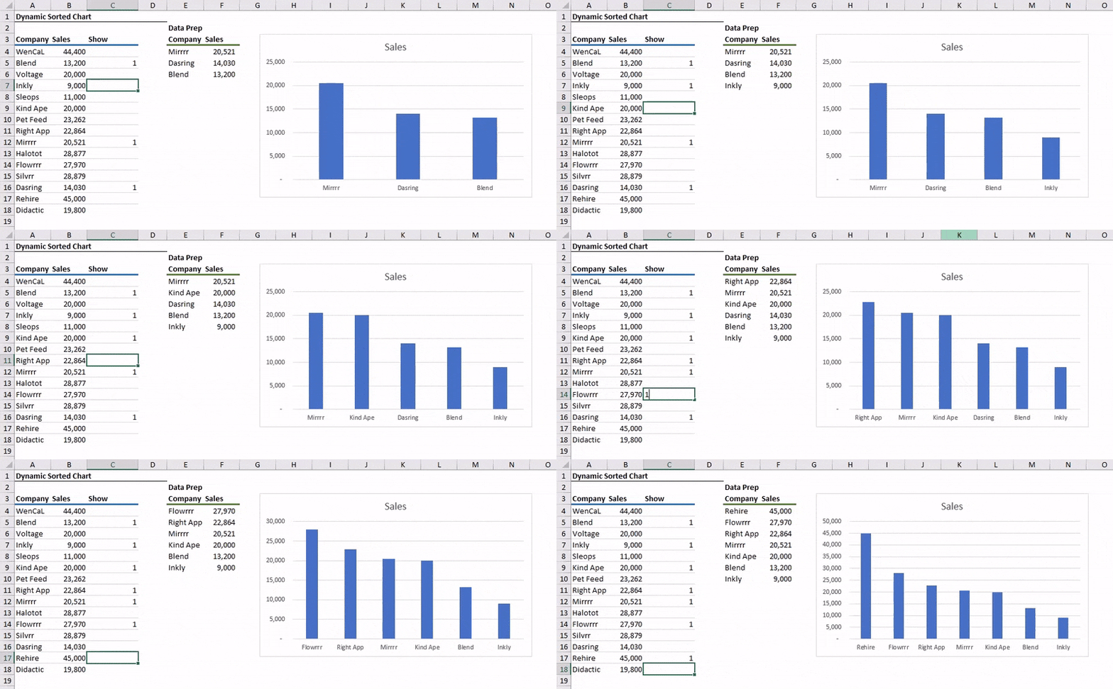
If we add or remove “1”s from the “Show” column, the chart automatically updates. If companies are removed, the chart no longer displays empty slots. If more companies are displayed than originally selected, the chart’s axis grows to incorporate the newly added companies.
Customizing the Chart
At this point, we can perform various visual customizations to enhance our chart. These include actions like:
- Add data labels to the bars
- Remove the y-axis labels
- Customize the title
- Recolor the bars
- Remove the horizontal gridlines
- Remove the chart border
A Slightly More Sophisticated Version of the Chart
To demonstrate additional flexibility that can be built into your dashboards, the downloadable exercise file (link below) contains a version that allows the user to select from a Data Validation dropdown list to select from a pre-programmed group of companies.
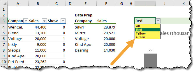
Based on the user’s selection, a calculated set of 1’s and 0’s is placed in the “Show” column. This, in turn, will cause the chart to redraw itself based on the targeted companies.
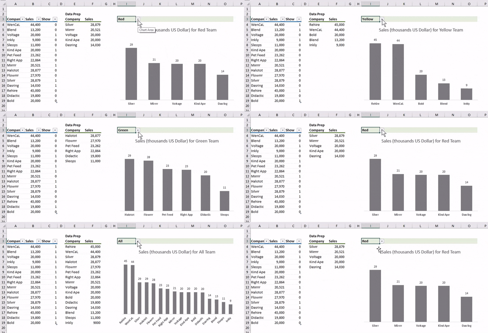
The trick to getting this to work is to have the group lists established off to the side…

…and a formula in the “Show” cells that adds a “1” to any company name listed in the user-selected group.
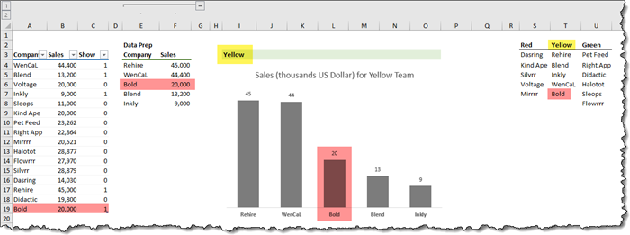
=IF($I$3="All", 1, SUMPRODUCT(($S$3:$U$8=A4) * ($I$3=$S$2:$U$2)))Don’t get too distracted by the formula, just understand that if the user selects “All” from the dropdown list, every company will receive a “1” in their respective “Show” cell.
If the user selects a team color (ex: “Red”), every company listed under the “Red” team will receive a “1” while the remaining companies will receive a “0”.
Don’t worry so much how the SUMPRODUCT function works; it’s just a seed we’re planting in your brain to show what is possible.
For more information on SUMPRODUCT, you can find videos and posts on the SUMPRODUCT function here and the XelPlus YouTube channel.
Growing and Shrinking Tables
To allow the user to insert additional rows into our table and have the data preparation table “see” these new entries, we’ve converted the original data into a proper Excel Data Table.
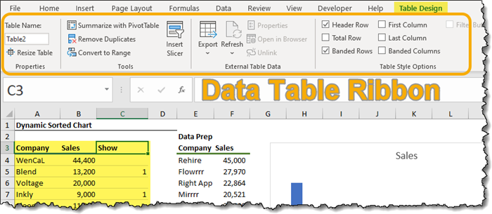
If we add a new company named “Bold” with sales of 20,000, the new company appears when we have “All” selected from the dropdown.
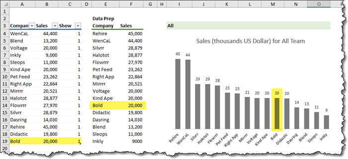
If we add “Bold” to one of our group lists (ex: “Yellow”) and we select the “Yellow” team from the dropdown, “Bold” is included in the chart.
Conclusion
By combining the power of Data Tables and Dynamic Array functions, we can create an incredible dynamic chart that shows the world how awesome you are in Excel.
Practice Workbook
Feel free to Download the Workbook HERE.

Leila Gharani
I'm a 6x Microsoft MVP with over 15 years of experience implementing and professionals on Management Information Systems of different sizes and nature.
My background is Masters in Economics, Economist, Consultant, Oracle HFM Accounting Systems Expert, SAP BW Project Manager. My passion is teaching, experimenting and sharing. I am also addicted to learning and enjoy taking online courses on a variety of topics.


