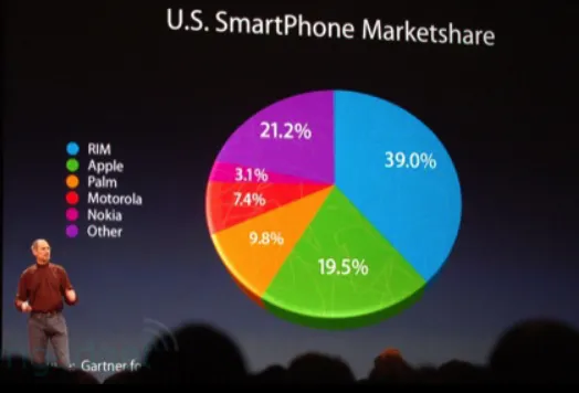
What works against pie charts:
- Difficult to compare slice sizes & values, especially when they are close in size.
- Can unnecessarily take up the readers time trying to match each slice with the correct category.
- Can become messy.
- Can be easily manipulated to give false impressions

What works in their favor:
- Can be created quicker than your boss can blink.
- It’s a circle. which means it shows the full picture.
- Require minimal additional explanation.
A compromise has to be made. I find Stephen Few’s suggestion (see video) to be just that!
Leila Gharani
I'm a 6x Microsoft MVP with over 15 years of experience implementing and professionals on Management Information Systems of different sizes and nature.
My background is Masters in Economics, Economist, Consultant, Oracle HFM Accounting Systems Expert, SAP BW Project Manager. My passion is teaching, experimenting and sharing. I am also addicted to learning and enjoy taking online courses on a variety of topics.


