Two of the most often head comments in training classes when demonstrating features are…
“I wish I knew that before.”
or
“Is this feature brand new?”
None of these features are new, but they are not the easiest to find or the most intuitive to implement.
Tip #1 Stop your chart from disappearing
Charts will often “lose” their information when the underlying data that drives the chart is hidden. The data can be hidden either by manually hiding rows or columns or may become hidden when using groups.
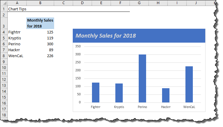
Let’s create a simple chart by highlighting our data (cells A3:B8) and then press the key combination ALT‑F1.
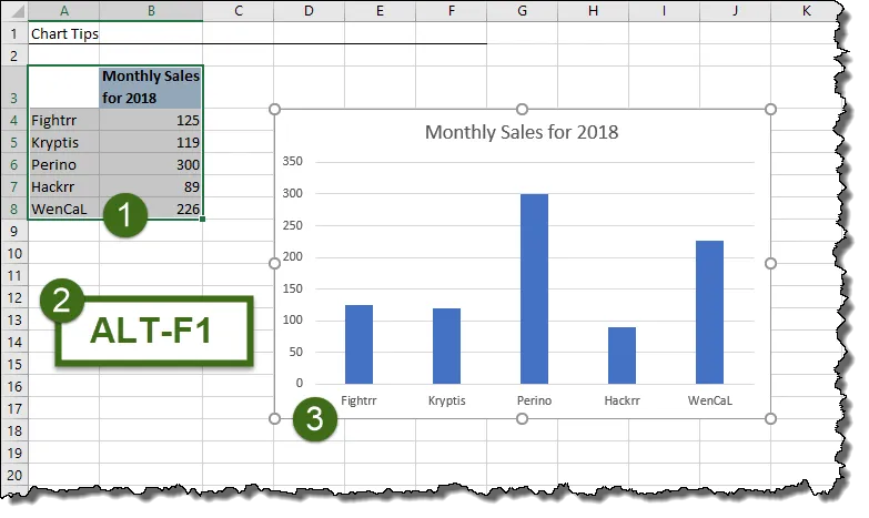
This inserts the default chart type, most likely the 2D Clustered Column chart.
If we were to select columns A & B, then right-click in the highlighted area and click “Hide”, observe what happens to the chart.
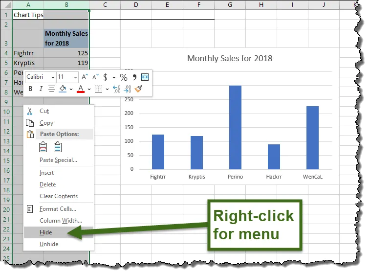
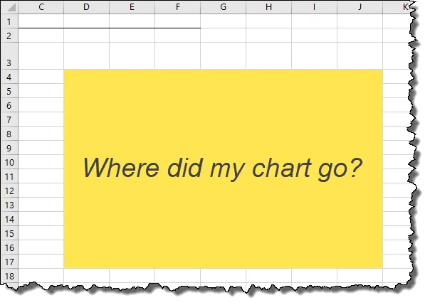
To prevent this from happening, we need to adjust one simple setting.
Click anywhere on the chart and from the ribbon select Chart Tools – Design (tab) -> Data (group) -> Select Data.
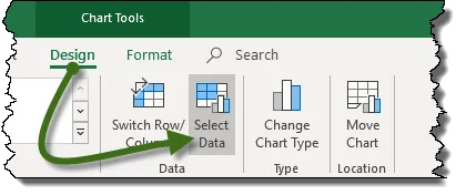
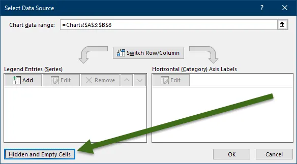
In the Select Data Source dialog box, click the button in the lower left labeled “Hidden and Empty Cells”.
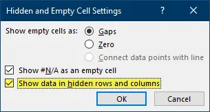
In the Hidden and Empty Cell Settings dialog box, check the box labeled “Show data in hidden rows and columns”.
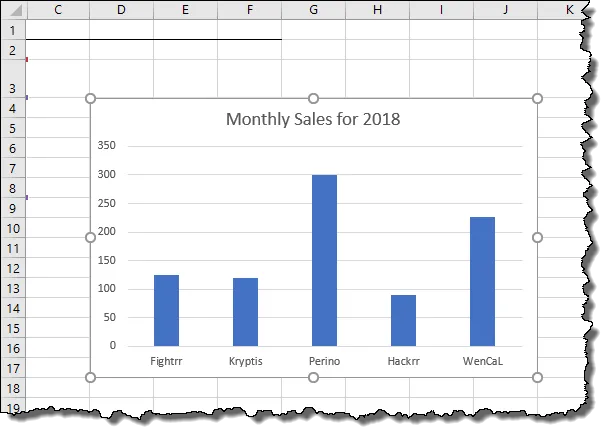
This will return your chart to its former glory.
This feature will also prevent your chart from disappearing if you are working with filtered or grouped data.
Tip #2 Snap chart to grid
“Snapping” is the act of having the corner of a chart or shape object line up with the natural gridlines of a worksheet.
The gridlines are a convenient guide for aligning and distributing objects on a worksheet.
The problem is that when we move a chart or a shape object, we are given the freedom to place the object anywhere we choose with almost precision. This is blessing as well as a curse because it is sometimes difficult to place objects with pixel-perfect precision.

With the Snap to Grid feature Excel will limit placement of charts and shapes to only intersection points on the grid.
To snap your chart, click and hold anywhere on the chart (the corners are usually the safest areas in a chart) and begin moving the chart. Hold the ALT key while moving the chart and you will see that the chart will only move in “steps” according the width and height of the columns and rows.
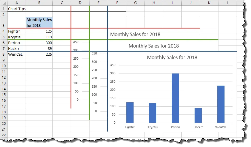
If you wish to have this snapping feature perform as the default move behavior, click anywhere on the chart and from the ribbon select Chart Tools – Format (tab) -> Arrange (group) -> Align -> Snap to Grid.
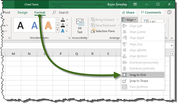
This menu option acts as a toggle. If the Snap to Grid feature is on, normal object movement snaps and the ALT key returns to “infinite movement” mode. If the Snap to Grid feature is off, normal object movement works in “infinite movement” mode and the ALT key invokes snapping mode.
Tip #3 Adding textboxes/shapes into your chart
Because we want our charts to stand out from all the other boring charts, we will improve the visualization of our chart by adding a custom title box not normally seen in an everyday chart.
Our objective is to add a shape object to the chart.
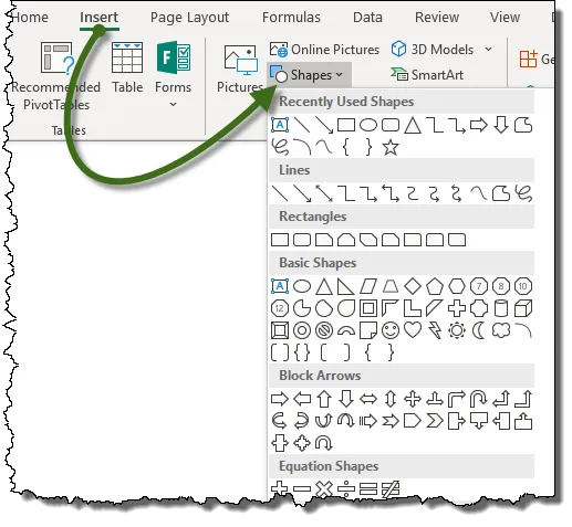
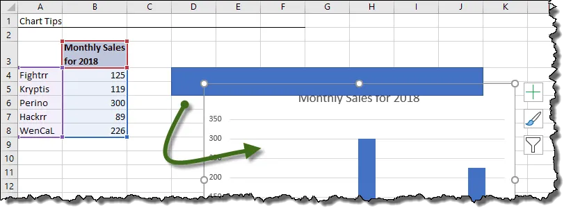
A common approach is to add a shape object to the sheet and place it in front of the chart. Shapes can be added by selecting Insert (tab) -> Illustrations (group) -> Shapes and selecting a shape form the shape library.
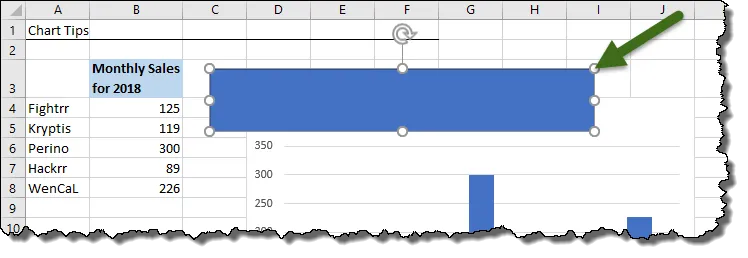
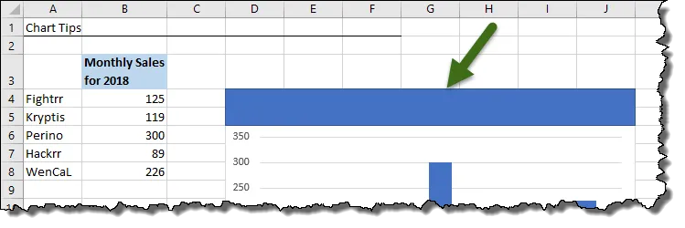
The problem with this technique is that if we move the chart, the shape remains in position (or vice versa.)
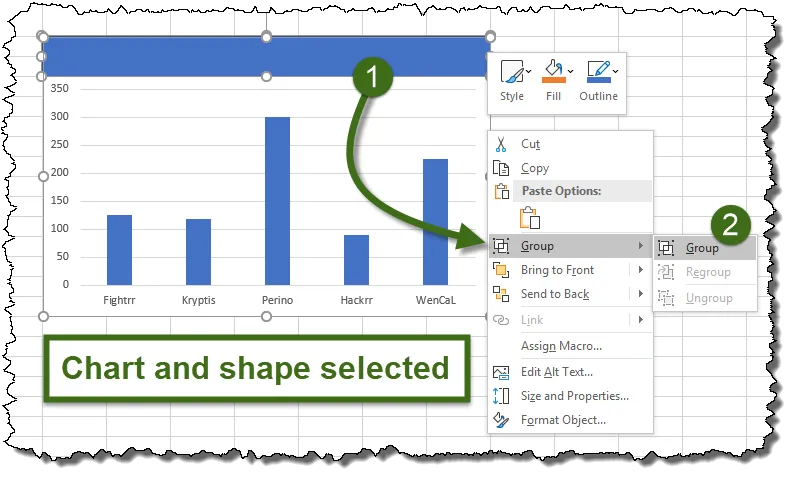
We could always group the chart and the shape to prevent this from happening. Select the shape, hold down the CTRL key and select the chart. With the objects selected, right-click on the chart and select Group.
There is a better way
Starting with our original chart, click anywhere on the chart object. The corners are considered the “safe zones”.
Insert a shape by selecting Insert (tab) -> Illustrations (group) -> Shapes and selecting a shape form the shape library.
Create the shape INSIDE the chart. This is the trick!
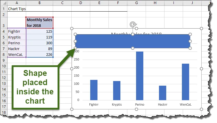
If we move the chart, the chart and the shape move as a single object.
Place a title in the chart by performing the following steps:
- Click the newly inserted shape in the chart
- Click in the formula bar and enter an equals sign
- Click on the cell holding the title information (ex: cell B3) to add a cell reference.
=’Charts’!$B$3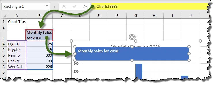
We can now stylize our title with fonts, sizes, and colors as well as borders and fill colors for the shape.
Practice Workbook
Feel free to Download the Workbook HERE.

Leila Gharani
I'm a 6x Microsoft MVP with over 15 years of experience implementing and professionals on Management Information Systems of different sizes and nature.
My background is Masters in Economics, Economist, Consultant, Oracle HFM Accounting Systems Expert, SAP BW Project Manager. My passion is teaching, experimenting and sharing. I am also addicted to learning and enjoy taking online courses on a variety of topics.


