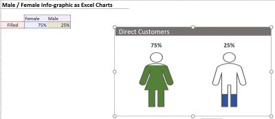
Setting up the data table
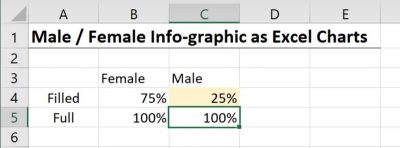
An additional series is needed in order to visualize the value as part of a total amount.
To do this, add a new series as shown below:
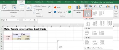
Inserting a Clustered chart
Highlight data to be plotted on the chart and go to Insert > 2D column > Clustered chart
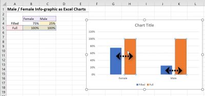
For now, this will show separate grouped columns for the Male and Female data.
Once the icons are in place, the series will be layered on top of each other to achieve a fill effect.
Inserting icons into the chart
Insert icons
Go to the Insert tab and select the icons to be used in the chart.
I suggest using a vector icon so that the fill color and outline color can be defined separately.
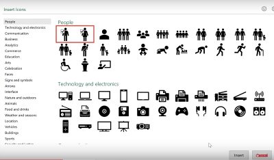
Format the icons as preferred through the Format tab
- Icon size
- Graphics outline
- Graphics fill – this color will dictate the color of the Filled series
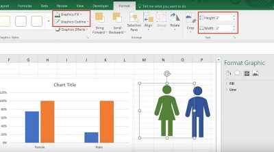
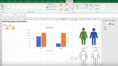
Duplicate the icons and define the formatting for the Full data series.
An empty fill can be used with a thick outline.
Featured Course
Visually Effective Excel Dashboards

Transfer full icons to the chart
Transfer the Full icons to the chart by clicking on the icon and pressing CTRL + C (or right-click and select Copy).
Click on the corresponding series on the chart.
Select a single series by double-clicking and then pressing CTRL + V to replace the column with the icon.
Make sure that a single series has been selected, or the entire series will be replaced with the icon.
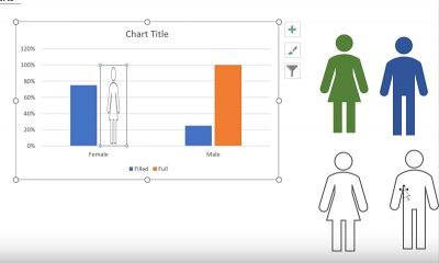
Do the same for the remaining Full series.
Widen icons
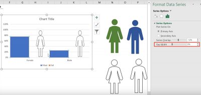
To widen the icons, change the gap width.
Select the chart and go to the series properties.
There are two options to get there:
- Press CTRL + 1
- Right click on the series and select Format Data Series
Under Series Options, set Gap Width to 0%.
Transfer filled icons to the chart
Do the same to transfer the filled icons to the chart.
However, you will notice that the icon shrinks instead of retaining its full size.
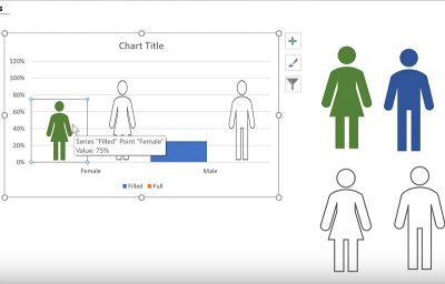
To change this into a cut-off version depending on the value, go to the Format Series Options and under Fill Color, select the Stack and Scale with option.
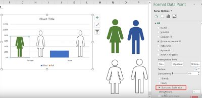
Repeat this for the Male Filled series.
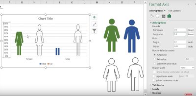
Formatting the chart axis
To maximize the chart area, set the maximum value of the vertical axis to 100%. Go to Format Axis > Axis Options > Maximum = 1.0
Overlapping the series
Under Series Options, set Series Overlap to 100%.
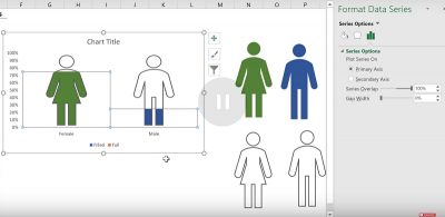
Note that by default, the series that does the final overlap (or is seen on top) is the last series on the data table.
To switch this, right-click on the series and go to Select Data.
Select the series to be moved and click on the up or down arrows.
Formatting the chart area
Further formatting can be done on the chart to give it a more polished look:
- Remove vertical axis labels
- Add or remove horizontal axis labels
- Remove gridlines
- Add or remove chart title
- Add data labels
To add the data labels, click on the + sign on the chart and tick the Data Labels option.
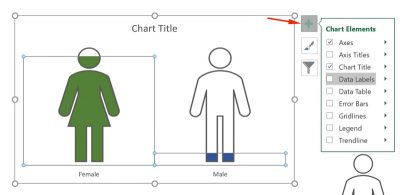
By default, this will display the value of the Full series instead of the Filled series.
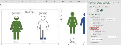
To change this, go to Formal Data Labels properties and under Label Options, tick Value from cells.
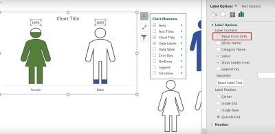
On the prompt asking for a Data Label Range, highlight the values of the Filled series.
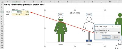
It would show both the value from the Filled series along with the original values.
To remove the latter, untick the Value option on the Format Data Labels options.
For older versions of Excel
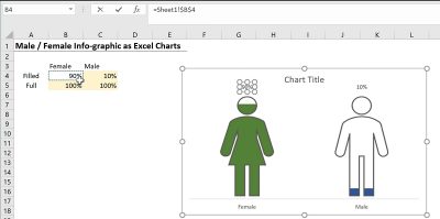
Double-click on the data label to select a single data label and go to the formula bar.
Do a cell reference to the value to be displayed.
Feel free to Download the Workbook HERE.

Leila Gharani
I'm a 6x Microsoft MVP with over 15 years of experience implementing and professionals on Management Information Systems of different sizes and nature.
My background is Masters in Economics, Economist, Consultant, Oracle HFM Accounting Systems Expert, SAP BW Project Manager. My passion is teaching, experimenting and sharing. I am also addicted to learning and enjoy taking online courses on a variety of topics.


