Setting Up the Data
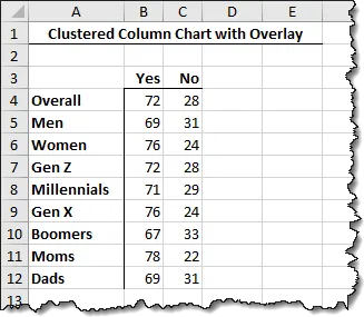
The first thing we need to do is set up the data.
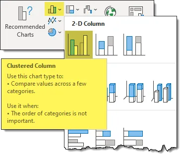
Next, we create a Clustered Column chart from the data. (Insert -> Charts -> 2D Clustered Column)
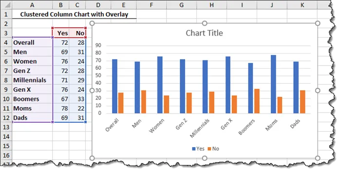
This gives us the following default chart.
Getting the Background Bars
Our next step is to represent the light gray bars in the background that reflect 100%.

The idea is to represent a second set of data that peaks at 100% (or 1) and to have that data set placed on the Secondary Y-axis to fall behind the original data set.
Let’s add two more series to the data set named “Full 1” and “Full 2”.
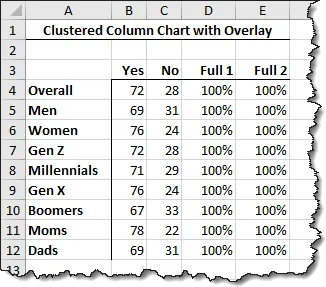
To bring the new data into the chart, a cool way to do this is by selecting the edge of the chart, then click and hold the blue grab-handle in the lower-right of the data and drag to the right two columns.
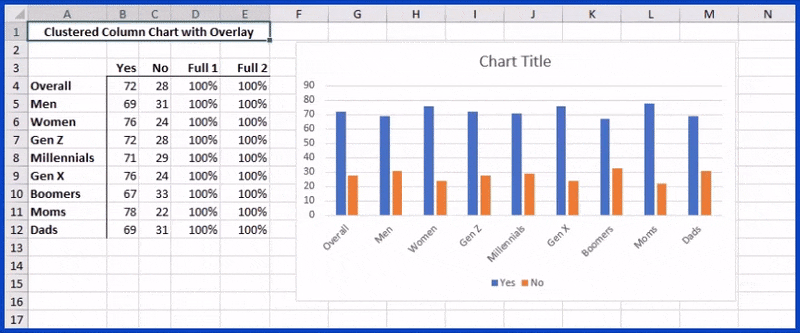
Another cool way to add data to a chart is to select the new data (in this case, cells D3 thru E12), click COPY, then select the chart, and click PASTE.
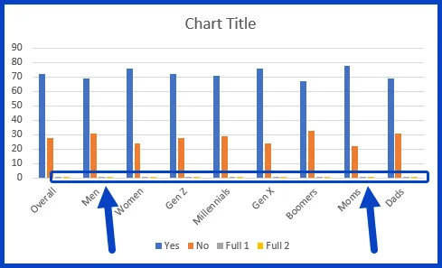
Now we have our updated chart with the new data set. The bars are tiny, but we’ll fix that soon.
Featured Course
Visually Effective Excel Dashboards

Placing the New Data on the Secondary Y-axis
Double-click on one of the newly added data points (the tiny ones) to open the Formatting panel (right). Set the “Plot Series On” to Secondary Axis.

Select the remaining data points of the newly added data and set it to the Secondary Axis as well.
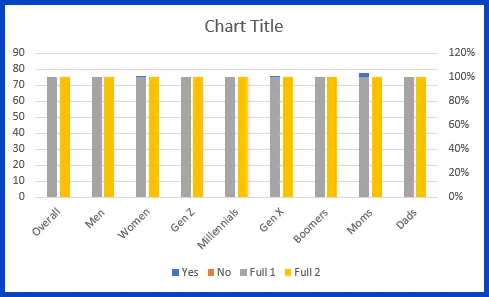
We’re getting closer, but there is still work to be done.
Swapping the Axis
Excel charts have a predilection for placing the Secondary Axis data in front of the Primary Axis data.
Because we need the 100% representation bars to be in the back, we will have to swap the “Yes/No” to the Secondary Axis while restoring the “Full 1/Full 2” to the Primary Axis.
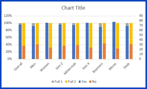
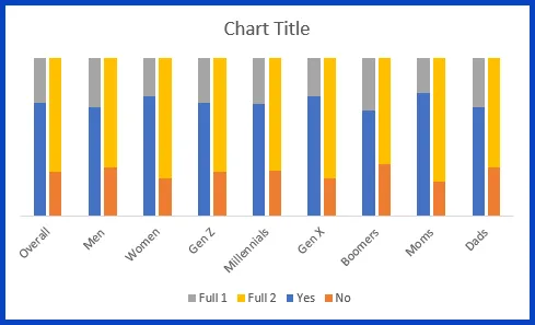
We’re getting close to our final image.
Setting the Axis Extents
Our next step is to get both the Primary and Secondary Axis labels to have the same lower and upper limit of 0% and 100% respectively.
Select the numbers along the Primary Axis (percentages) then set the Axis Bounds to Minimum=0 and Maximum=100.

We don’t need to see the percentage labels next to the axis (it’s an implied 0% to 100%), so we will set the Label Position option to None.

Do It All Over Again
For the Secondary Axis, repeat the above steps for setting the lower and upper axis limits as well as hiding the axis labels.
While we’re at it, click on any horizontal gridline in the chart and press DELETE on the keyboard to remove the Major Gridlines.
Setting the Chart Colors
Our next step is to get the colors of the bars to match the colors used in the chart of the report.
Because Excel is all about the numbers, its ability to detect colors in objects is a bit on the anemic side. Luckily for us, Excel’s more fun-going cousin, PowerPoint, is really good at figuring out the exact colors of objects thanks to a feature called the Eyedropper.
- Select the chart and click Copy.
- Open PowerPoint
- On the starting slide, click PASTE.
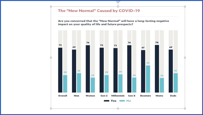
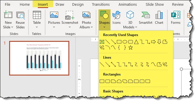
- Insert any shape of any size onto the slide (Insert -> Shapes).
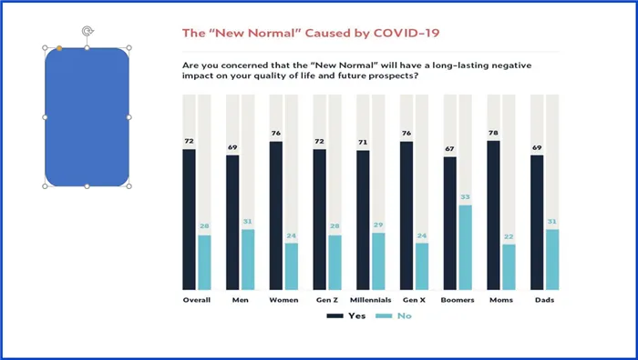
To determine the colors of the lighter colored bars (the background and “No” bars), we will use the Eyedropper tool to set the fill color of the shape to the background bar’s color and the outline of the shape to the “No” bar’s color.
- With the shape selected, click Shape Format (tab) -> Shape Styles (group) -> Shape Fill -> Eyedropper.
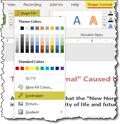
- Click on one of the lighter colored background bars in the chart.
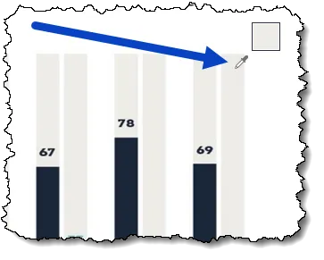
- With the shape selected, click Shape Format (tab) -> Shape Styles (group) -> Shape Outline -> Eyedropper.
- Click on one of the “No” bars in the chart.

NOTE: I increased the width of the border to see the color more easily.
Now that we have established the colors in a shape, we can examine the shape’s settings to see the color codes of the fill and border colors.
- With the shape selected, click Shape Fill -> More Fill Colors.
In the Colors dialog box, on the Custom tab, we can see the RGB (Red/Green/Blue) and HEX codes used for setting the fill color. These numbers will be used for the background bar colors.
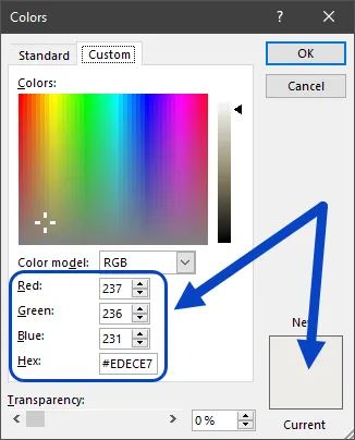
Perform the same steps to determine the Shape Outline color.
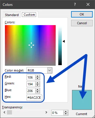
Make note of these values as you will need them for setting the bar colors in Excel.
Setting the Bar Colors
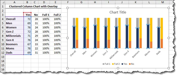
Setting the “Yes” Color
These are easy as they appear black.
Click on a “Yes” bar and select Format -> Shape Fill -> Black. If this is a bit too dark, perhaps an 85% gray or extremely dark blue.
Setting the “No” Color
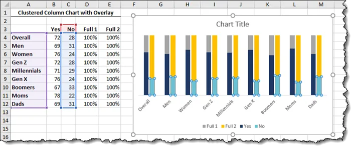
We will use the RGB codes from the PowerPoint shape’s outline color.
Click on a “No” bar and select Format -> Shape Fill -> More Fill Colors.
In the Colors dialog box, select the Custom tab and enter either the Red/Green/Blue codes OR the Hex codes. You don’t have to enter both as entering one will set the other.
Setting the Background Colors
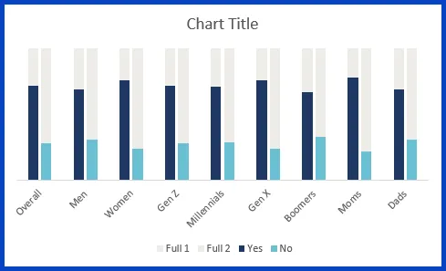
We will use the RGB codes from the PowerPoint shape’s fill color to set the background bar colors.
Select one of the “Full 1” bars (originally a medium gray color) and select Format -> Shape Fill -> More Fill Colors.
In the Colors dialog box, select the Custom tab and enter either the Red/Green/Blue codes OR the Hex codes.
Repeat this process for the “Full 2” bars.
Narrowing the Gap
To bring the sets of bars closer to one another, double-click either the “Yes” or “No” series.
In the Format Data Series controls, set the Gap Width to 100%.

This sets the Gap Width for both “Yes” and “No” bars (i.e, Primary Axis bars).
Perform the same steps on either of the Secondary Axis bars.
Presenting the Numbers Over the Bars
Next, we will display the values over the bars by enabling the Data Labels feature.
Right-click a “Yes” bar and select “Add Data Labels”. Do the same thing for the “No” bars.
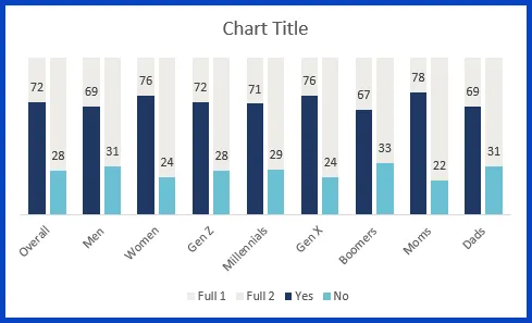
Select the newly displayed Data Labels and perform the following cosmetic adjustments:
- Increase the font size
- Activate the Bold feature
- Set the font color to match the associated bar color
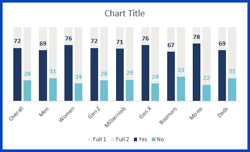
To correct for the slanted X-Axis titles, either select the titles and reduce the font size or increase the width of the chart. Consider applying the Bold feature to the titles.
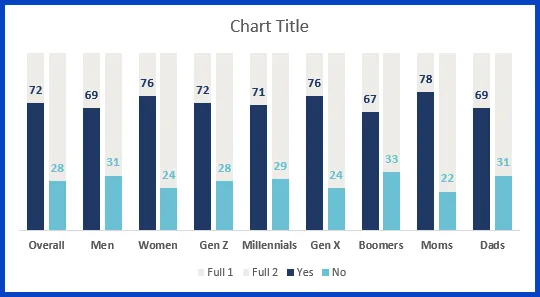
Tweaking the Legend
We don’t wish to have the “Full 1” and “Full 2” entries in the Legend, so perform the following steps to remove these entries:
- Click the Legend
- Click the “Full 1” entry
- Press DELETE on the keyboard
- Click the Legend
- Click the “Full 2” entry
- Press DELETE on the keyboard
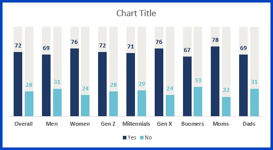
Customizing the Titles
Now that we have successfully recreated the chart, it’s time to add the text entries above and below the chart.
As we have quite a bit of text to add, we will forego the use of the Chart Title and instead use Textboxes to add the text.
Click the Chart Title and press DELETE on the keyboard. This has a side-effect of increasing the size of the chart within the chart canvas.
Click on an empty part of the chart between the bars to select the Plot Area. Using the circular handle at the top center of the chart, pull down to create a space for the titles to reside.
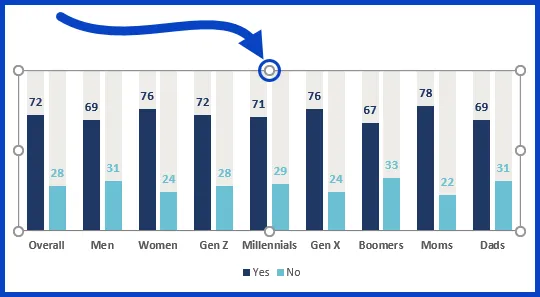
Now that we have regained our text space for titles, insert a text box (Insert -> Text Box) and replicate the text seen in the original report chart.

Comparing the Charts
Below is a screenshot of the chart as it appears in the report.
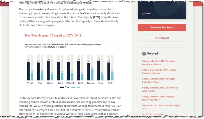
And here is our version.

Not too bad if I do say so myself.
“But Wait!!! You’ve missed something!”, I hear you saying.
Yes, your incredibly keen eyes have detected a subtle difference in the charts. In the report chart, the font color for the “No” in the legend is the same as the “No” bars. Can we do that, too?
Yes.
Click the legend, then click the “No” entry in the legend. Set the font color to the same color used in the “No” bars.
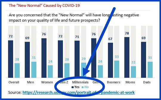
P-E-R-F-E-C-T ! ! !
Practice Workbook
Feel free to Download the Workbook HERE.

Leila Gharani
I'm a 6x Microsoft MVP with over 15 years of experience implementing and professionals on Management Information Systems of different sizes and nature.
My background is Masters in Economics, Economist, Consultant, Oracle HFM Accounting Systems Expert, SAP BW Project Manager. My passion is teaching, experimenting and sharing. I am also addicted to learning and enjoy taking online courses on a variety of topics.


