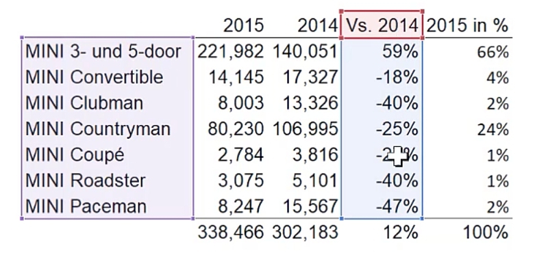
As an example, we have a sales volume report for each MINI vehicle as shown below:
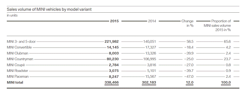
This table compares the sales of each MINI vehicle model for 2015 and 2014, and compares its proportion to total 2015 sales.
In order to know what type of chart to use, think about the message of the table.
In this case, BMW wants to report a significant increase of sales for their MINI classic brand.
Looking at the 2015 sales volume, the MINI 3- and 5-door model had the highest sales.
Compared to the previous year, we see there’s over 50% of positive change.
This followed by the MINI Countrymen model, with 90,230 units sold.
However, compared to the previous year, there is a -25% difference.
The rightmost column shows a 100% total, which tells us that we are looking at the full picture of all the MINI models.
This current layout requires an in-depth look to grasp the message of the table.
Going through the numbers is more time-consuming than having a graphical representation of this data such as this:
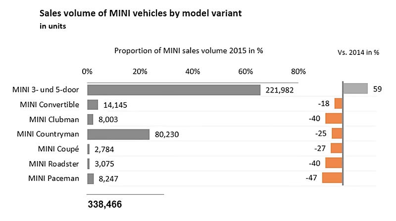
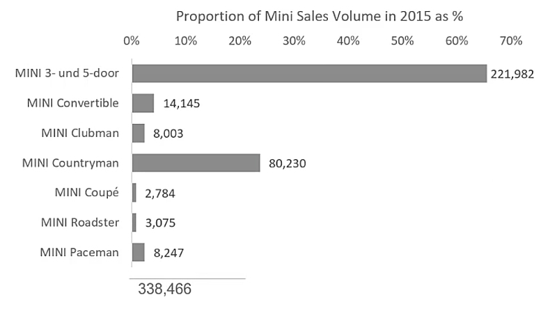
In this chart, we can easily see that the MINI 3- and 5- door model had the highest volume of 2015 sales and that it’s the only one that has such a positive change in comparison to 2014.
This chart also shows the sales proportion of each model compared to the total.
It actually shows three things in one glance:
- the proportion of the sales volume in terms of the total
- the actual value for the sales volume in 2015
- the percentage change to the previous year.
At the bottom it also shows the total sales.
Featured Course
Fundamentals of Financial Analysis

Copying the data to Excel
The first thing to do is to transfer the screenshot of the data table into Excel.
We can incorporate the following formulas:
Sum of 2015:
Cell N14 = SUM(N7:N13)Sum of 2014:
Cell O14 = SUM(O7:O13)Vs. 2014:
Cell P7 = (N7-O7)/O7and drag this down to cell P13.
2015 in %:
Cell Q7 = N7/N14and drag this down to cell Q13.
Sum of Vs. 2014:
Cell P14 = SUM(P7:P13)Sum of 2015 in %:
Cell Q14 = SUM(Q7:Q13)
Creating the Sales Volume bar chart
Our final chart is composed of two bar charts.
The first one shows both the sales volume and the proportion.
To know which data to select, ask yourself what do you want to see on the axis?
In this case, we want to show the proportion of sales for that year in %, and so we pick those cells when creating the chart.
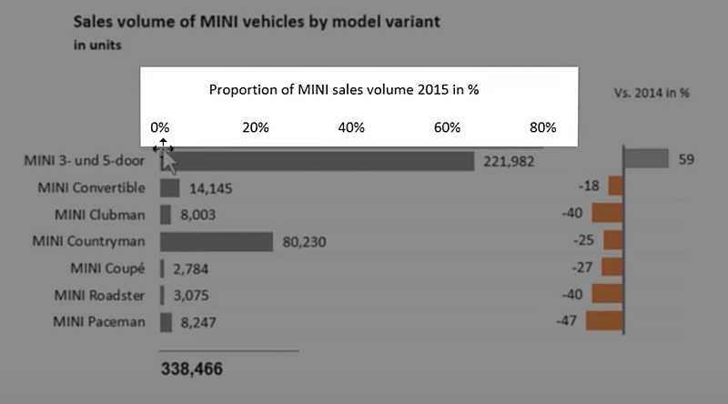
Highlight the first column (M6:M13), hold down the SHIFT key and highlight the column containing the proportion of sales % (Q6:Q13).

Go to the Insert tab and select the bar chart icon.

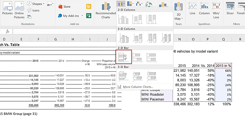
By default, Excel inserts the data in reverse order, putting the first row in the data table (MINI 3- and 5- door) at the bottom of the bar chart and the last row (MINI Paceman) at the top.
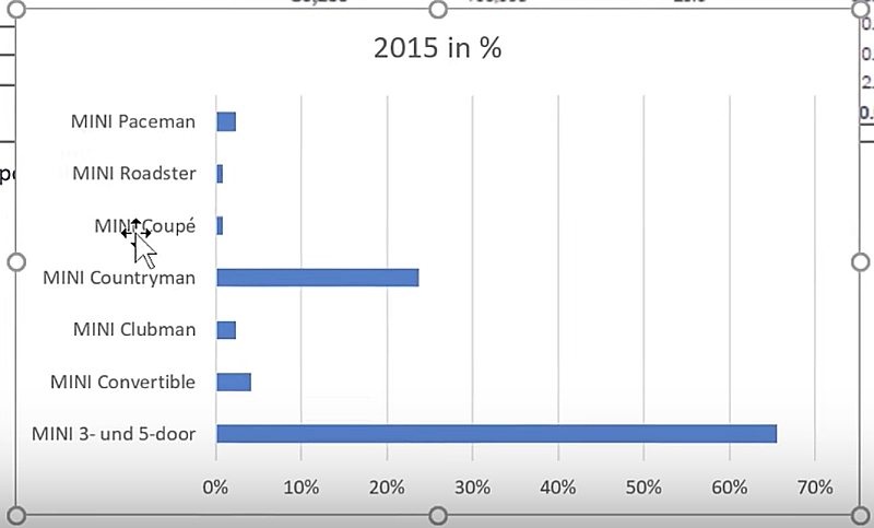
To reverse this order, double click on the data labels to activate the chart options.
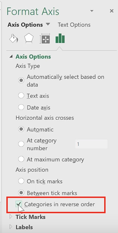
Under the Axis options tab (rightmost tab on the Format Axis panel), tick the box for Categories in reverse order found under Axis position.
It should now follow the same order of the entries in the data table, with the MINI 3- and 5- door now be at the top and the MINI Paceman model at the bottom.
Add data labels to show the sales volume of each model, by right-clicking the bar series and select Add data labels.
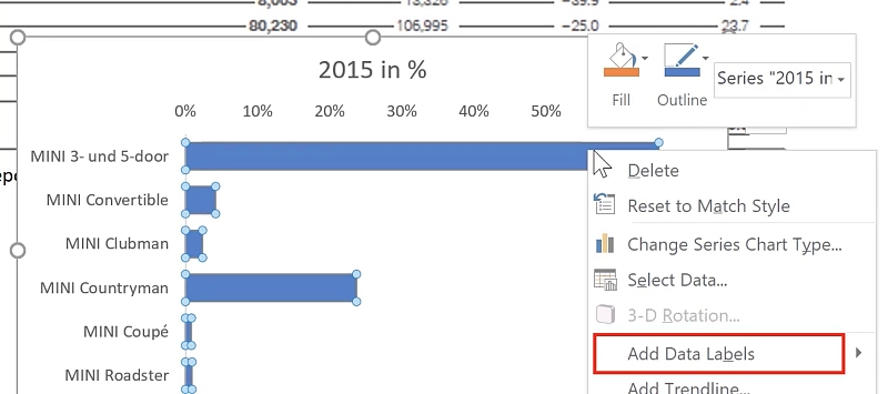
By default, Excel adds the same data label as we plotted, which would be the sales %.
Since we want to show the sales volume, we have to change the labels.
For Excel versions before 2013
Here, you will need to select each data label manually.
To do this, click on the label and then click it once more.
Make sure that only one data label is selected.
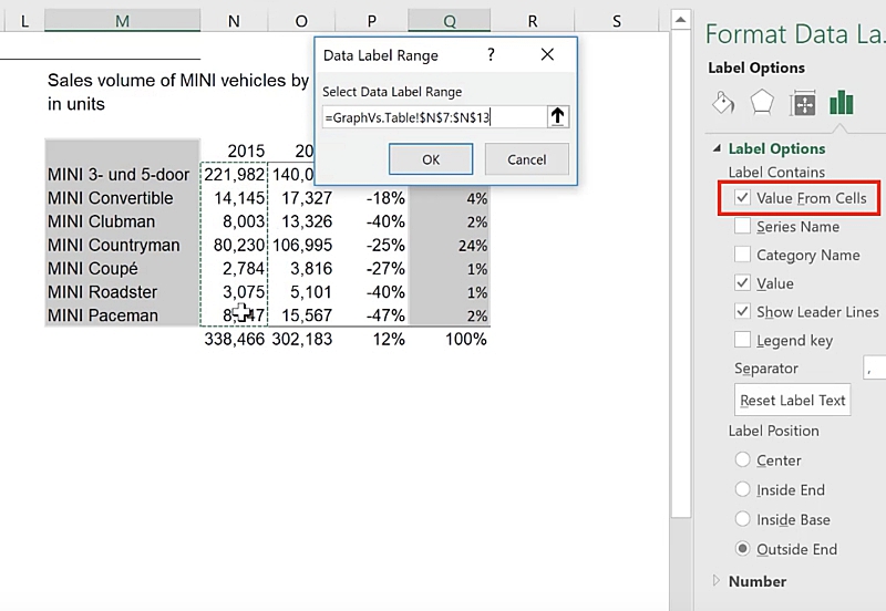
Instead of typing the values out one-by-one, we want the chart to be dynamic.
This means that by using cell references, when the values of the data table change, the chart follows suit.
In the formula bar, do a cell reference to the specific value you want to display.
For MINI 3- and 5- door, it is =N7.
Press ENTER.
It now shows the sales volume of MINI 3- and 5-door instead of the 66%.
Do the same for the rest of the data labels one-by-one.
Chart formatting
You can further format the overall look of the chart according to your preference.
In this example, I made the following changes:
- I removed the gridlines by clicking on the gridlines and press DELETE.
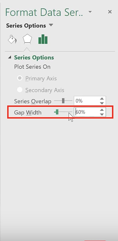
- I reduced gap width by double clicking on the bar series and specified a gap width of 60% in the Format Axis panel.
- Changed the bar color to gray.
- Renamed the title of the chart to “Proportion of Mini Sales Volume in 2015 as %”.
Adding the total sales volume
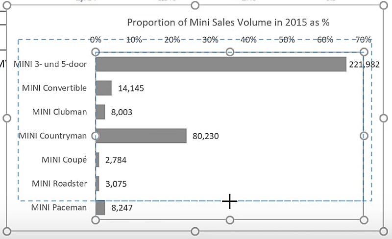
To make space for the total sales volume, we need to resize the chart.
First, click on the plot area.
Then click on the small middle circle and drag it up.
Select the chart so that it’s active.
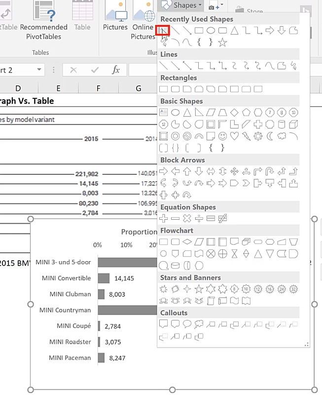
Go to the Insert tab, under Shapes, click on the Text box icon.
Go to the formula bar and make a cell reference to the value you want to display.
To display the total 2015 sales volume, use =N14.
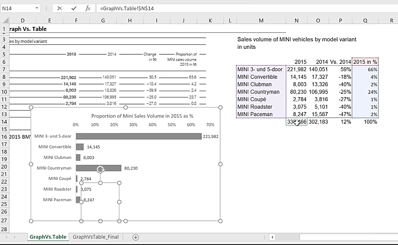
Press ENTER and it will display the value.
The advantage here is that the textbox is embedded in the chart, so when the chart is moved, the textbox moves along with it.
Resize the textbox and format it as you see fit.
If you want to add a line above the total, click again on the chart and insert a line from the Insert tab > Shapes.
To make sure that the line is straight, hold down the SHIFT key and draw the line.
Creating the 2015 vs 2014 comparison chart
We also want to add another chart to show the change from previous year (Column P).
Since we have already set up this chart with the formatting and the sizing, a fast way to recreate a second chart is to duplicate the first.
That way we don’t need to do the formatting all over again and the alignment would be spot on.
To do this, select the first chart, press CTRL + C, click anywhere on the sheet, and press CTRL + V.
Change the series to the series that we want – the one displayed in the second chart.
Instead of using Q6, Q7:Q13, drag them to P6 and P7:P13, respectively.
You will now notice that the values displayed on the chart have changed.
The idea is to reposition this chart beside the first one, and in this way, we don’t need the same data labels for the second chart.
Clicking on the data labels and pressing DELETE would also delete the vertical axis line at the 0% mark.
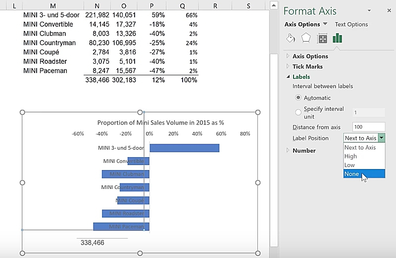
If you want to retain this line, another way to remove the data labels is to go to the Format Axis panel > Axis Options > Labels and for Label Position, select None from the dropdown.
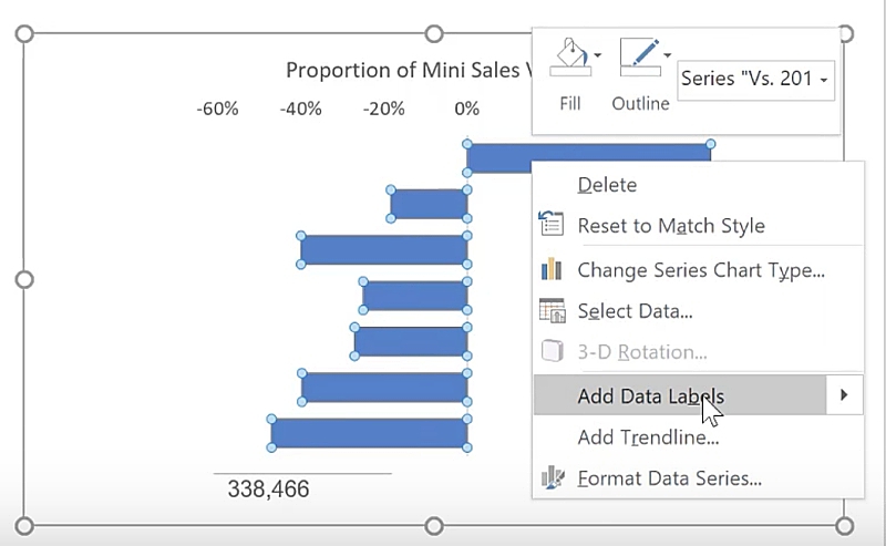
Add the data labels by clicking on the series, do a right mouse click and select Add Data Labels.
Since the data labels already show the percentage, we no longer need the horizontal axis labels on the top.
Click on it and press DELETE.
Update the chart title to describe what is being shown in this chart.
Click on the title and in the formula bar, do a cell reference to the column heading of the data. In this case, =P6.
Reposition and resize the width of the plot area and chart area as desired.
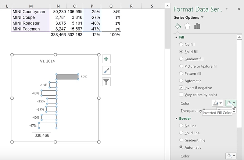
We also want the bars to have a different color when the value is negative.
For Excel 2010 onwards, there is an automatic feature that does this.
- Click on the data series
- Go to the Format Data Series panel
- Under the first tab, expand the Fill
- Tick the box for Invert if negative.
- By default, the negative bars will be shown as white. To change this, first specify a color for the positive value.
- You will notice that there is now a second dropdown option for the inverted fill color. Here you can specify the color for the negative value.
Instead of having the total sales volume at the bottom of the second chart, change the cell reference to the total % change by selecting the textbox and typing =P14 in the formula bar.
Drag the second chart over the first chart and align the bars.
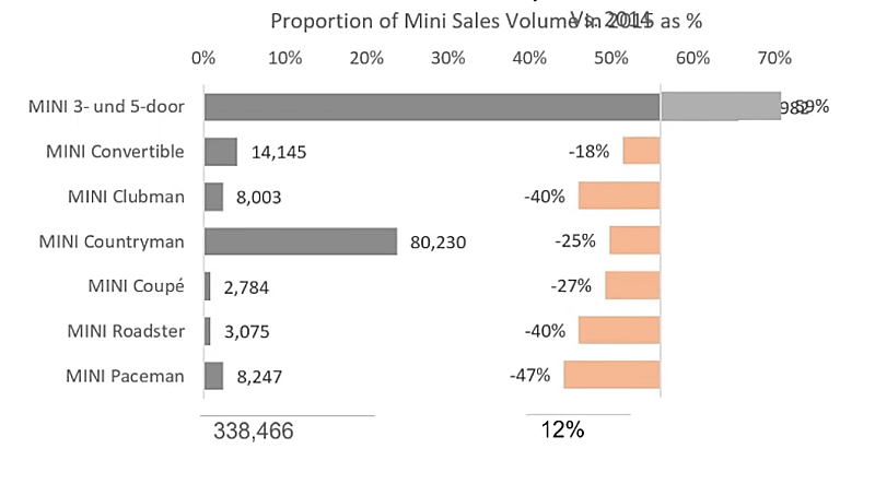
Once aligned, hold down the CTRL key and click on the border of the second chart.
You will notice that the selection of the chart is now indicated by circles at the four corners.
Move the chart to the right by pressing on the Right Arrow key.
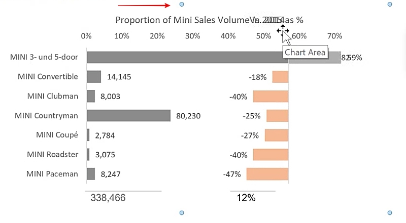
Another way to do this is to hold down the SHIFT key and use the mouse to drag the chart.
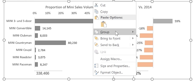
As a last step, group both charts together so that you can move them together.
To do this, hold down the CTRL key and select both charts.
Right-mouse-click and select Group.
Feel free to Download the Workbook HERE.

Further reading

Alternative to Doughnut Charts

Better Tables in Reports
Leila Gharani
I'm a 6x Microsoft MVP with over 15 years of experience implementing and professionals on Management Information Systems of different sizes and nature.
My background is Masters in Economics, Economist, Consultant, Oracle HFM Accounting Systems Expert, SAP BW Project Manager. My passion is teaching, experimenting and sharing. I am also addicted to learning and enjoy taking online courses on a variety of topics.


