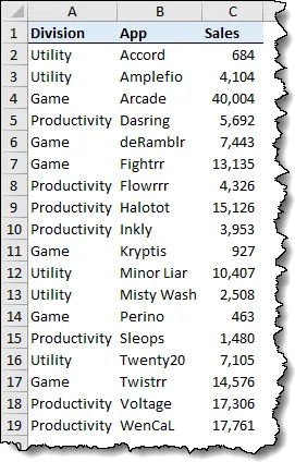
We begin this journey into the Wonderful World of Interactivity with a sample data set that occupies range A1 through C19.
We want to create Radio Buttons for each Division. These buttons will be used to control which data is displayed in the chart.
Bringing Order to Chaos
Our data is a bit messy, so we will begin by cleaning up the data to make it more “chart-friendly”. This will be accomplished by creating what is known as a “data preparation table”. This table acts as a go-between to take messy data and transform it into something more conducive to charting.
Start by entering a title in cell E1 labeled “Data Prep”.

Setting Up the Option Buttons
Next, we’ll create the three buttons used to control the data preparation area.
The buttons will change the prep area and the chart will be built from that same prep area. This will give the user the illusion of the buttons changing the chart when really there is a go-between service behind the scenes.
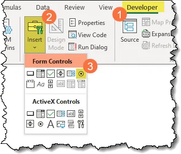
The Option Buttons are accessible via the Developer tab.

If you do not see the Developer tab at the top of your program, right-click on any visible ribbon and select “Customize the Ribbon…”.
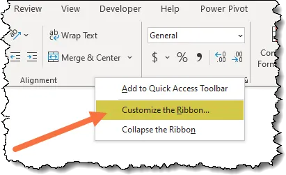
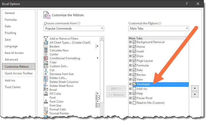
In the Excel Options dialog box, place a check in the box next to “Developer” on the righthand list and click OK.
With the Developer ribbon displayed, in the Controls group, select Option Button in the upper group of buttons labeled Form Controls.
After you click the Option Button control, click and drag a small rectangle somewhere on the screen to add your first option button.

Rename the button to “Game” by clicking within the text of the option button and rename the text.

We want two more Option Buttons, one for “Utility” and one for “Productivity”.
Right-click on the “Game” option button and select Copy. Click the Paste button twice to produce two duplicates of the “Game” button. Place the buttons in some temporary arrangement.

PRO TIP: You can hold the CTRL key and click the first option button to select it, then continue holding the CTRL key and drag the button to a new location and release the mouse. This will execute the mouse version of a Copy/Paste operation.
Rename the option buttons so each button represents a specific Division.

Featured Course
Master NEW Excel Functions in Office 365 & Office 2021

Option Button Interactivity
When you click one of the option buttons, the empty circle is filled with a black dot. This indicates a selection has been made.
If you select a different option button, the currently selected button will be deselected in favor of the new choice.

If you were to place additional option buttons on the sheet, they would work in unison.
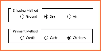
But suppose you wanted two groups of option buttons that serve unrelated purposes (ex: shipping method and payment method)?
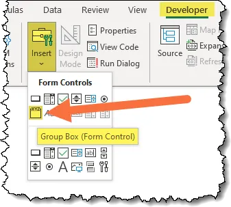
To inform Excel as to which option buttons should work together, you surround the related option buttons with a Group Box control.
Storing the Selected Button’s Result
When an option button is selected, we need to store a value in a cell to indicate which is the active button.
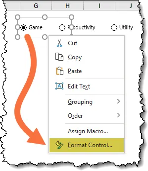
Right-click on one of the option buttons and select “Format Control…”.
In the Format Control dialog box, on the Control tab, set the Cell Link option to point to cell F1.
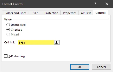
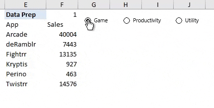
When we select one of the option buttons, a number between 1 and 3 is displayed in cell F1.

It is not necessary to set the Cell Link option for the other buttons. As they are all automatically understood to be related, the cell selection of F1 has been assigned to all of the buttons.
Creating the Data Preparation Table
The next objective is to construct a table based on the user’s selection when using the option buttons.
This table will be a filtered version of the original table but only as it pertains to the selection Division.
If you are using Microsoft 365’s offering of Excel, you have access to the amazing new FILTER function.
Start by creating headings for our prep table. Enter the words “App” and “Sales” in cells E2 and cell F2 respectively.

In cell E3, enter the following formula:
=FILTER(B2:C19, A2:A19 = SWITCH(F1, 1, “Game”, 2, “Productivity”, 3, “Utility”) )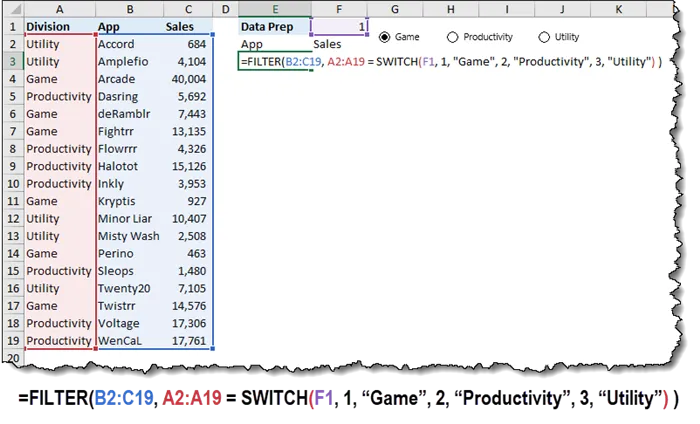
The SWITCH function takes a value (cell F1) and checks it against a list of items. If the value is in the list, the value is switched with a different value. In this case, numbers are placed with words (Divisions).
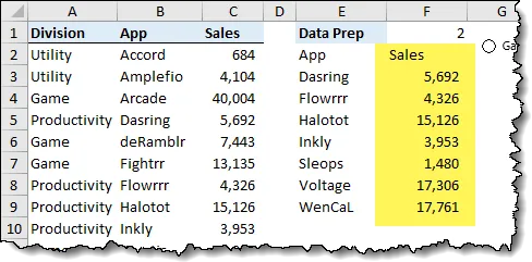
To make the values in the “Sales” column appear more readable, we’ll add a comma style with no decimal places.
Visualizing the Data
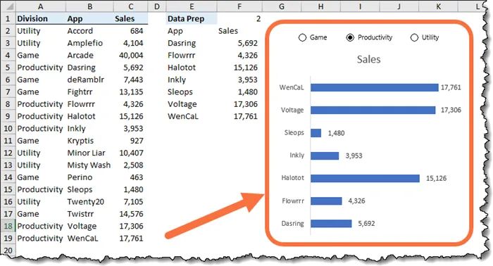
Everybody loves a good chart, especially an interactive chart.
To create the interactive chart, select the cell range holding the results (E2:F9) and insert a 2-D Clustered Bar chart.
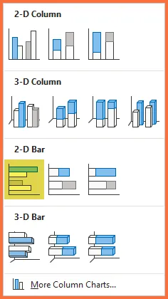
Let’s alter a few of the cosmetic aspects of the chart to make it easier to read.
- Move and size it next to the data prep area
- Move the option buttons to be near and above the chart
- Remove the Horizontal Axis
- Add Data Labels to the bars
- Remove the Vertical Gridlines
- Set the Shape Outline of the chart to “no outline”
Sorting the Chart
As the data is presented in alphabetical order (from the bottom – up), it would likely be better to display the information in performance order (i.e., largest to smallest sales).
This is easily done by nesting the existing FILTER/SWITCH functions inside a SORT function.
=SORT(FILTER(B2:C19, A2:A19 = SWITCH(F1, 1, “Game”, 2, “Productivity”, 3, “Utility”) ), 2 )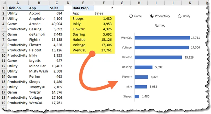
The SORT function is telling the results of the FILTER/SWITCH to be sorted in ascending order by the 2nd column, the “Sales” column.
Because the 2-D Cluster Bar chart naturally plots from the bottom – up, we get the best sales at the top then descending in sales to the bottom.
“All is not well in the Kingdom”
When testing the various Divisions, we observe that when selecting a Division with fewer Apps, our chart has unwanted gaps towards the top of the vertical axis.
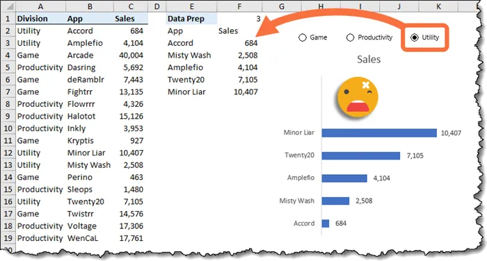
What may not be so obvious is that if a Division has more Apps than were originally charted, those additional Apps will not be displayed.
This is a huge problem.
To solve this problem, we need to make our chart smarter so it can dynamically detect the range it needs to plot.
Unfortunately, chart ranges will not accept formulas or Dynamic Array Hash references, only cell references.
A workaround to this limitation is to use the Name Manager to act as a translator.
Featured Course
Black Belt Excel Package

Create a Named Reference for the Data Prep Results
Named Range for “Sales”
To create a named range that will point to the data prep area’s “Sales” results, perform the following steps:
- Select cell F3
- Click Formulas (tab) -> Defined Names (group) -> Name Manager
- In the Name Manager dialog box, click New
- In the New Name dialog box, enter the following information:

The formula in the “Refers to:” field reads as follows:
=INDEX(Data!$E$3#, , 2)The $E$3# hash reference says to get all the results of the formula in cell E3, but the INDEX function effectively reduces the results to only display the 2nd column of the results.
Named Range for “Apps”
To create a named range that will point to the data prep area’s “Apps” results, perform the following steps:
- In the Name Manager dialog box, click New
- In the New Name dialog box, enter the following information:
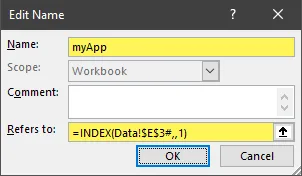
The formula in the “Refers to:” field reads as follows:
=INDEX(Data!$E$3#, , 1)The $E$3# hash reference says to get all the results of the formula in cell E3, but the INDEX function effectively reduces the results to only display the 1st column of the results.
Assigning the Named Ranges to the Chart
To assign the newly created named ranges as data sources for the chart, right-click anywhere on the chart and choose “Select Data…”.
Making the “Sales” Dynamic
Above the left panel labeled “Legend Entries (Series)”, select the “Sales” entry and click “Edit”.
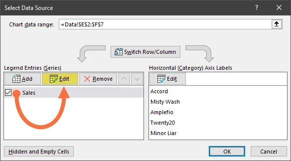
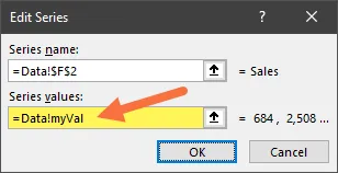
In the Edit Series dialog box set the “Series Values” option to read as follows:
=Data!myValNOTE: Make sure you retain the sheet name and only replace the cell range reference.
Making the “Apps” Dynamic
Above the right panel labeled “Horizontal (category) Axis Labels”, click “Edit”.
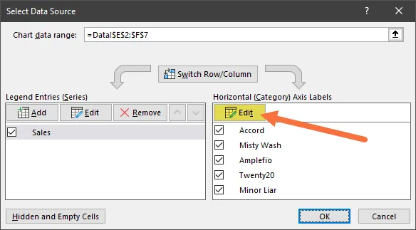
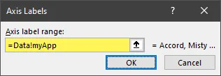
In the Axis Labels dialog box set the “Axis Label Range” option to read as follows:
=Data!myAppNOTE: Make sure you retain the sheet name and only replace the cell range reference.
Testing the Chart Range
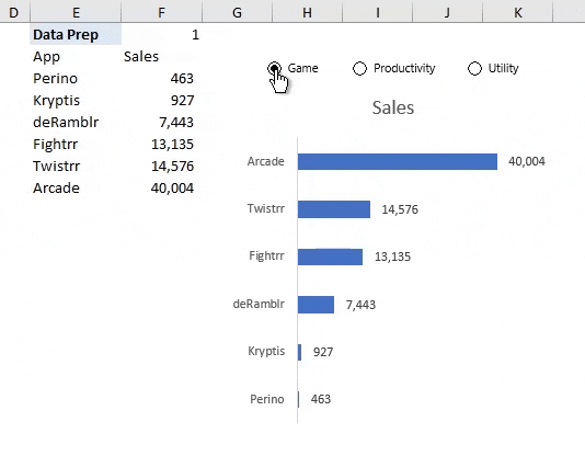
If we click through the Divisions using the option buttons, we see that the proper range of data is selected for each Division.
Creating a Dynamic Chart Title
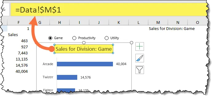
Let’s put a cherry on top of this amazing, dynamic chart by creating a chart title that changes with the user’s Division selection.
NOTE: Just like chart ranges, Chart Title elements can’t have formulas stored in them. We can get around this limitation by creating a formula (i.e., logic) in a cell off to the side, then use that cell’s address in the Chart Title element.
We will create a formula that uses the same SWITCH function logic as before to select the Division based on the selected option button. We’ll enhance it by concatenating some descriptive, fixed text to the beginning of the SWITCH function.
Select a cell somewhere off to the side of the report and enter the following formula:
=“Sales for Division: ” & SWITCH(F1, 1, “Game”, 2, “Productivity”, 3, “Utility”)
Next, select the Chart Title element in the chart. In the Formula Bar, enter the cell address of the formula you just created.
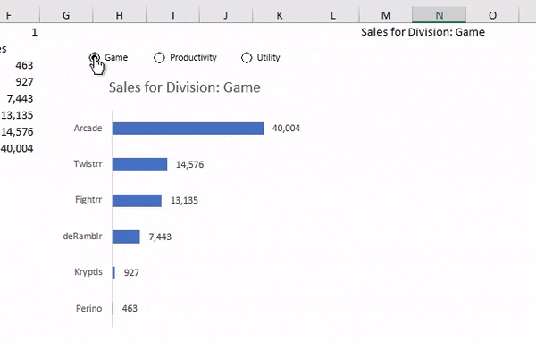
When we switch between Divisions using the option buttons, our Chart Title element reflects the selected Division.
Practice Workbook
Feel free to Download the Workbook HERE.
Leila Gharani
I'm a 6x Microsoft MVP with over 15 years of experience implementing and professionals on Management Information Systems of different sizes and nature.
My background is Masters in Economics, Economist, Consultant, Oracle HFM Accounting Systems Expert, SAP BW Project Manager. My passion is teaching, experimenting and sharing. I am also addicted to learning and enjoy taking online courses on a variety of topics.


