Customization #1
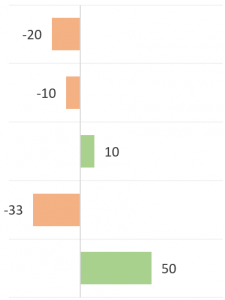
We want to have different colors for our positive valued bars versus our negative valued bars.
Customization #2
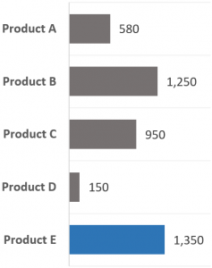
Have the bar with the highest value set to a different color.
Along the way to achieving these customizations, we will encounter some of my favorite chart tweaks for common column/bar charts.
NOTE: Many of these customizations can be applied to most chart types. Don’t limit your creativity to column/bar charts.
The Data & Core Bar Chart
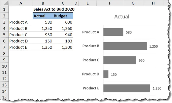
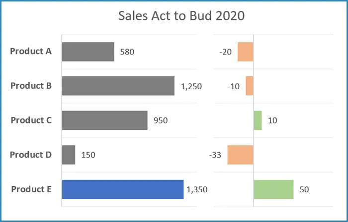
We have Actual vs. Budget information for five products (A thru E).
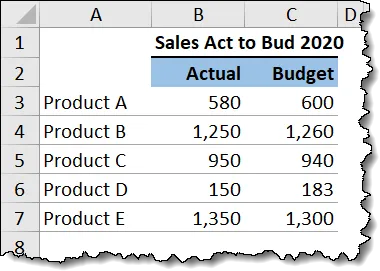
Our first chart will only plot the Products against the Actuals.
- Select cells A2 thru B7 and insert a standard 2-D Clustered Bar chart (Insert (tab) -> Charts (group) -> 2-D Bar -> Clustered Bar).
- Remove the Horizontal Axis Major Gridlines.
- Remove the Horizontal Axis.
- Right-click any bar and add data labels by selecting Add Data Labels.
- Select a Product name from the vertical axis and make the font Bold and 10 points in size.
- Reduce the space (gap) between the bars by clicking once on any bar, then press CTRL-1 to open the Format Data Series From here, select the Series Options icon (tiny column chart icon) and set the Gap Width to 80%.
- With the bars selected, set the color to a medium gray by selecting Format (tab) -> Shape Styles (group) -> Shape Fill.
- Remove the chart border by selecting the edge of the chart, then select Format (tab) -> Shape Styles (group) ->Shape Outline -> No Outline.
- Reduce the width of the chart by about 50% (this is performed manually via the chart resize handles).
- Reorder the product names so they match the display order of the products in the data. Select a Product in the chart and apply a checkmark to the Axis Options -> Categories in Reverse Order
- To make the chart easier to read once we mate it with the variance chart, we will display horizontal gridlines by selecting Chart Design (tab) -> Chart Layouts (group) -> Add Chart Element -> Grindlines -> Primary Major Horizontal. Consider coloring the gridlines a light gray so they are not distracting but remain useful.
NOTE: Ensure that the Plot Area has enough room to display the largest product value by reducing the width of the Plot Area relative to the Chart Area. This may take some trial-and-error to get set perfectly.
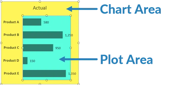
Our finished base chart appears as follows.
Creating the Difference Chart
We need to display the deviation of Actual vs. Budget in a second bar chart with all the same customizations as the first bar chart.
I know what you’re thinking; “I don’t want to do all that work again. Is there a shortcut trick for this?”
Yes, there is.
We need to calculate the difference between the Actual and the Budget. This will be done to the right of the data in a data preparation area. These results will drive the lengths of the bars in the second chart.
- Enter a title for the new data in cell E1 named “Data Prep”.
- Enter a sub-title in cell E2 named “Difference”.
- Enter the following formula in cell E3 and repeat the formula down to cell E7.
=B3 – C3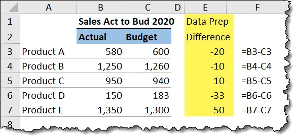
- Select the Product and Budget data (highlight A2 thru A7, hold CTRL and highlight E2 thru E7).
- Insert a standard 2-D Clustered Bar chart (Insert (tab) -> Charts (group) -> 2-D Bar -> Clustered Bar).
Here comes the shortcut…
- Click the edge of the first chart and press CTRL-C (or click the Copy button).
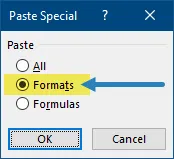
- Click the edge of the second chart and select Home (tab) -> Clipboard (group) -> lower part of the Paste button -> Paste Special -> Formats.
Be honest; how many of you even knew you could do that?
We now have two charts with the same visual settings. The only setting that did not carry over with the shortcut trick is the chart width. You’ll have to fix that one manually.
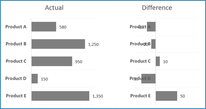
We can fine-tune the second chart with the following customizations:
- Remove the Product names form the Vertical Axis by selecting a Product name -> Format Axis (panel on right) -> Axis Options -> Labels -> Label Position -> None.
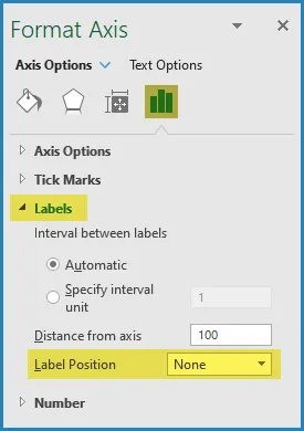
NOTE: You don’t want to select a product name and press the Delete key as this will remove the Vertical Axis along with the product names.
Customization #1 – Different Colored Bars for Positive and Negative Values
To start, we want to place these charts close to one another, giving us the illusion of a double chart.
- With the second chart selected, remove the chart fill color by selecting Format (tab) -> Shape Styles (group) -> Shape Fill -> No Fill.
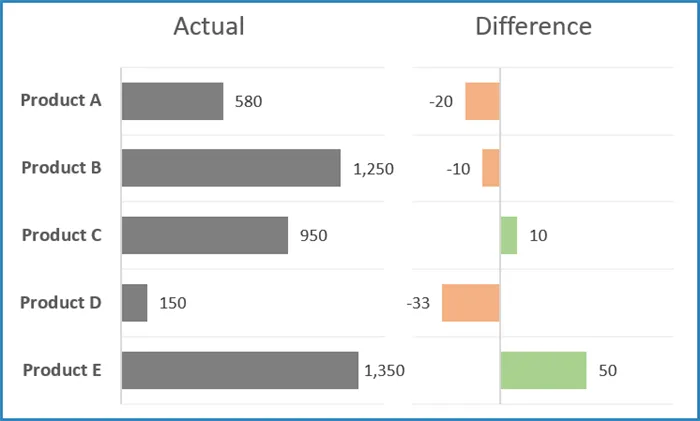
- Position the two charts side-by-side.
- Select a bar from the second chart and place a checkmark in the Format Data Series -> Series Options -> Fill & Line -> Fill -> Invert if Negative. This will activate two color controls: one for positive values and one for negative values.
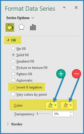
We now have conditionally formatted colors for our bars.
Customization #2 – Different Color for the Maximum Value Bar(s)
The great thing about this customization is that you can apply this technique for almost any form of formatting provided you can write the logic as a formula.
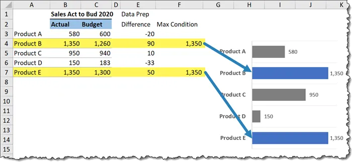
For this example, we want to have the bar with the largest value displayed with a different color. If there is a tie for the largest value, then all maximum valued bars need to have the different color.
This will be done to the right of the data in a second data preparation area. These results will display bars for the largest value in the first chart.
- Enter a title for the new data in cell F2 named “Max Condition”.
- Enter the following formula in cell F3 and repeat the formula down to cell F7.
=IF(B3=MAX($B$3:$B$7), B3, “”)
Next, we need to add the new calculations to the first chart.
- Select the first chart click Chart Design (tab) -> Data (group) -> Select Data.
- In the Select Data Source dialog box, click Add under Legend Entries and enter the below parameters in the Edit Series dialog box.
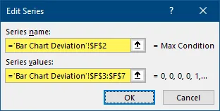
The newly added data series appears as follows:
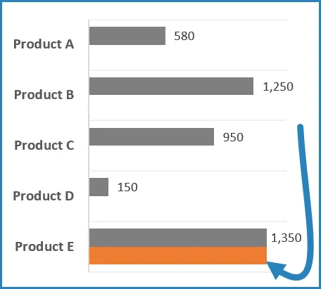
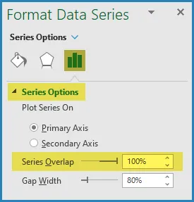
- To get the new bar to appear in front of the companion bar for that same product, select Format Data Series -> Series Options -> Gap Width and set the value to 100%.
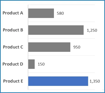
- Set the color of the newly added bar by selecting Format (tab) -> Shape Styles (group) -> Shape Fill -> Blue (or any color you prefer.)
Notice that in the event of a tie for the highest value, all maximum bars are colored.
Final Adjustments to the Charts
- Move the title to be centered above both charts and link the title element to cell B1.
- Select both charts and group them together by clicking Shape Format (tab) -> Arrange (tab) -> Group.
Practice Workbook
Feel free to Download the Workbook HERE.

Leila Gharani
I'm a 6x Microsoft MVP with over 15 years of experience implementing and professionals on Management Information Systems of different sizes and nature.
My background is Masters in Economics, Economist, Consultant, Oracle HFM Accounting Systems Expert, SAP BW Project Manager. My passion is teaching, experimenting and sharing. I am also addicted to learning and enjoy taking online courses on a variety of topics.


